Sarah Barnard Celebrates Over Ten Years of LEED Accreditation

sarah laughing.JPG

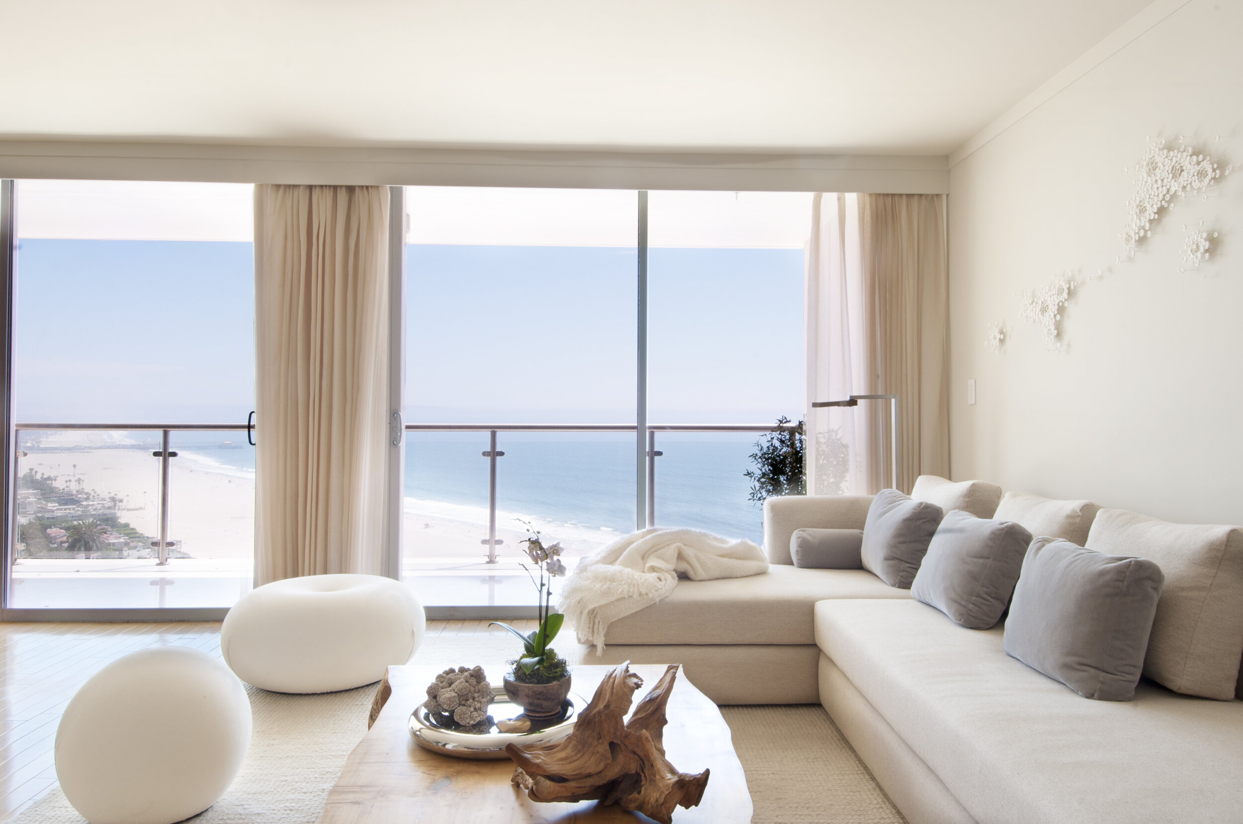
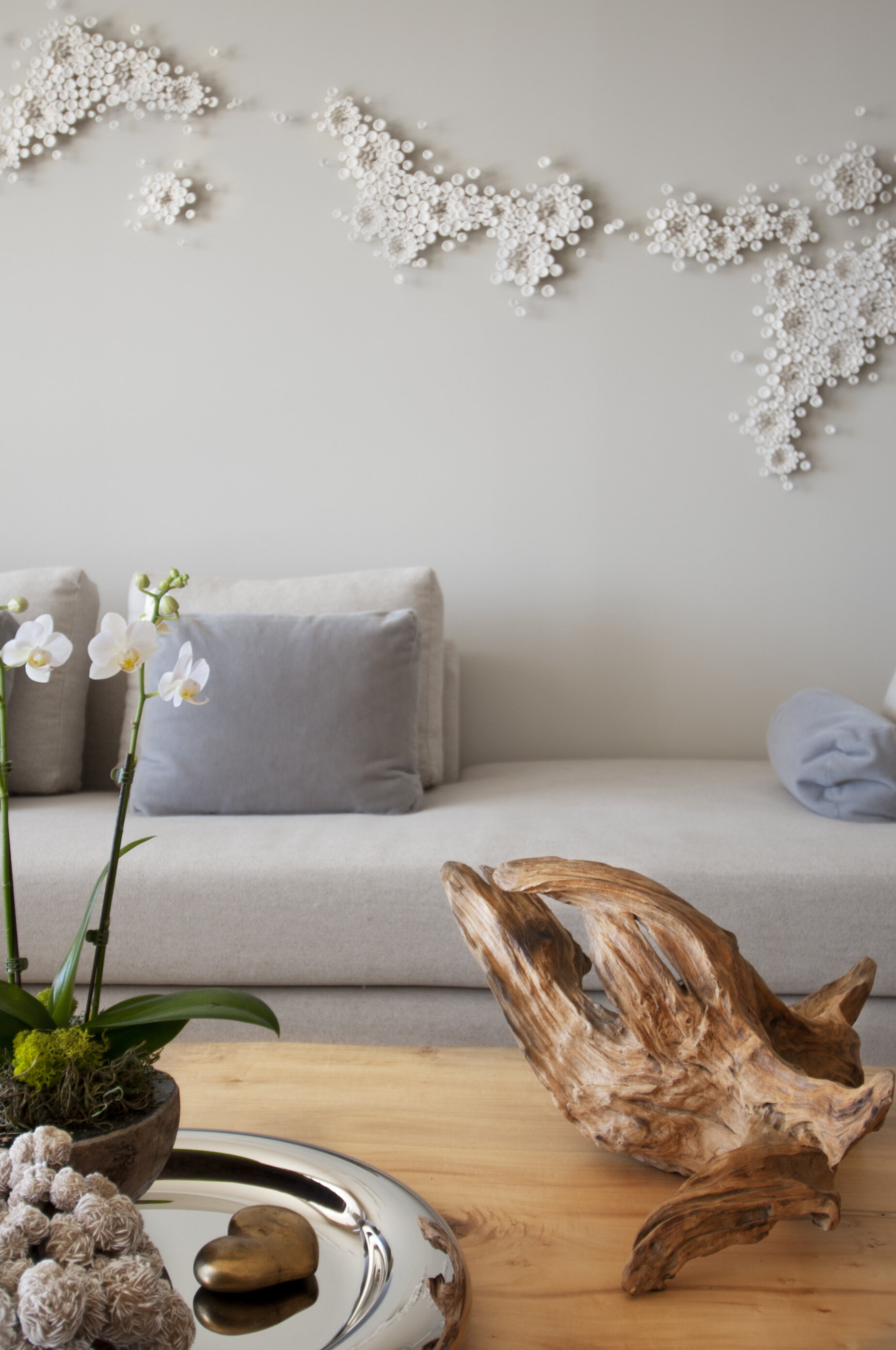
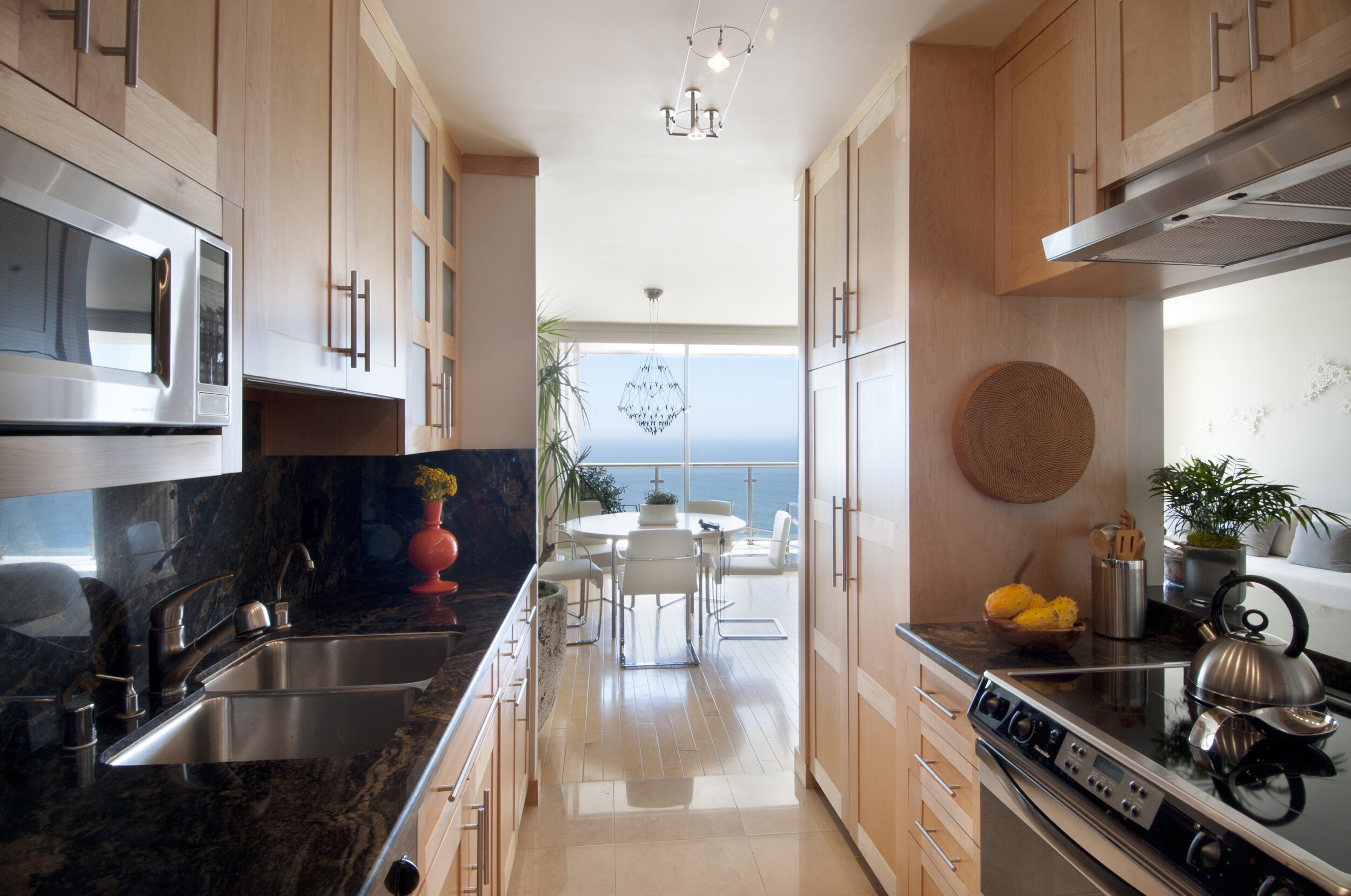
Leadership in Energy and Environmental Design Accredited Professional (LEED AP) designers bring their expertise to every project, creating healthy and environmentally responsible spaces for their clients. LEED certified buildings and homes provide lasting benefits for users, the surrounding community, project stakeholders, and the environment at large.

Photos by: Brad Nicol

Photos by: Brad Nicol

A sustainably designed, constructed, and maintained LEED-certified building positively affects the health of its employees or residents by improving air quality, reducing exposure to toxins, and ensuring adequate levels of natural light. LEED buildings yield lower operating costs and higher resale values and lease-up rates for property owners. They also consume less water and energy, reduce carbon emissions, and divert waste from landfills.

dining 4.jpg

LEED-certified homes benefit not only their inhabitants but the community and environment. Green homes offer year-round comfort and healthy indoor environments. They, too, use less water and energy, which is a win for homeowners’ wallets but also reduces strain on the community’s resources. LEED-certified homes are known to sell faster and for more money, which can raise property values for the entire neighborhood.

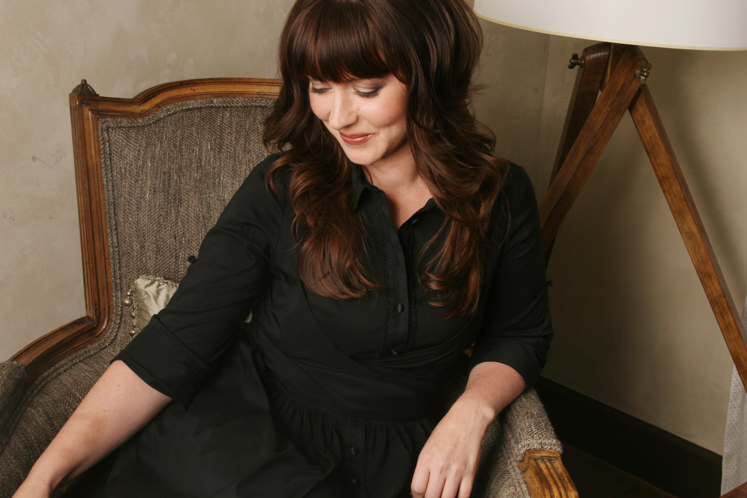
Sarah Barnard is an interior designer, WELL AP, and Legacy LEED AP who recently celebrated the 13th anniversary of earning her LEED credentials. Legacy LEED AP is the title given to early participants in the program who passed the LEED exam before 2009 when the U.S. Green Building Council introduced specialties.

“I care about the future of our environment and work to ensure that my home design projects support wellness for people and the planet,” says Barnard. “The Legacy LEED AP credential demonstrates my long-standing commitment to healthy, sustainable design.”

media 1.jpg

As a leading expert in her field, Barnard has given lectures at the University of California, Los Angeles (UCLA), California State University, Northridge (CSUN), Fashion Institute of Design and Merchandising (FIDM), and SCALE: The American Society of Interior Designers (ASID) National Student Summit. She has presented at the LA Home and Garden Show, Pacific Design Center, California Preservation Foundation, and Textile Arts LA. Most recently, OM Chats hosted Barnard and fellow design leaders Adaeze Cadet (AIA, LEED AP BD+C, Vice President at HKS) and Julie Smith-Clementi (AIA, ISDA, Product Designer and Architect, Smith-Clementi) to take part in a multi-speaker conversation around the role of empathy in home design.

In 2017, Barnard was recognized as an ASID Ones to Watch scholar in the program’s inaugural class. ASID created the leadership development training program to promote diversity and propel the industry forward. Barnard confers with a national network of her fellow interior design scholars to share research and feedback.

kit3.jpg

While the LEED rating system focuses on the design, construction, and operation of buildings, the WELL Building Standard emphasizes the health and wellness of the people inside of them. The LEED and WELL programs are complementary and receiving accreditation with both has informed Barnard’s holistic approach to healthy, sustainable home design.

dining 1.jpg

Barnard is an advocate for consciousness, inclusivity, and compassion in the creative process. Through her speaking engagements, pro-bono work, and writing, Barnard hopes to draw attention to these critical design objectives. Barnard is creating a future that includes greener buildings, healthier interiors, and enlightened home design.

Classic Blue, Pantone's Color of the Year creates calm and inspires clarity in interior spaces.

Interior Design: Sarah Barnard, Photos: Steven Dewall, Painting: Reid Winfrey

Interior Design: Sarah Barnard, Photos: Steven Dewall, Painting: Reid Winfrey

Blue brings us a sense of peace, offers us refuge, aids concentration, and brings us clarity. It is a reflective tone that fosters resilience and gives us hope, qualities we look toward during this uneasy time in the world. Pantone's Color of the Year is Classic Blue, chosen to reflect our desire for a stable future as we enter into a new decade. TIME calls the Color of the Year, "both constant and classic." It is reminiscent of a serene sea and the sky at dusk.

Pantone provides a universal language of color that is used by more than ten million designers and producers around the world to define colors accurately across different platforms and industries. Their Color Institute is dedicated to researching purchasing trends across various industries to determine each year's color. Pantone has been naming a Color of the Year since 2000 and has influenced product development and purchasing decisions in fashion, interior design, industrial design, graphic design, and advertising.

beachy bachelor (8).jpg

Classic Blue is akin to the very first Color of the Year, Cerulean. The hue represented the excitement of a new millennium, while also offering a sense of protection and serenity amidst the feared approach of Y2K. This year, we are experiencing a similar feeling of trepidation from the United States to the United Kingdom, Hong Kong, Syria, and across the globe.

beachy bachelor (14).jpg

The reigning Color of the Year offers reassurance, confidence, and connection for us in a time of uncertainty. "When we look at the world around us, we know that we're living with a lot of unrest, where some days don't feel quite as secure," said Leatrice Eiseman, Executive Director of the Pantone Color Institute, in an interview with Architectural Digest. "Blue from an emotional, psychological standpoint, has always represented a certain amount of calm and dependability. It's a color that you can rely on."

beachy bachelor (30).jpg

Classic Blue is the color of deep ocean water or a handful of ripe blueberries. It is a part of the art market, the beauty industry, automotive manufacturing, tech, and space sciences. Its associations with dependability, trustworthiness, and constancy make it a great color to incorporate into your home design.

beachy bachelor (17).jpg

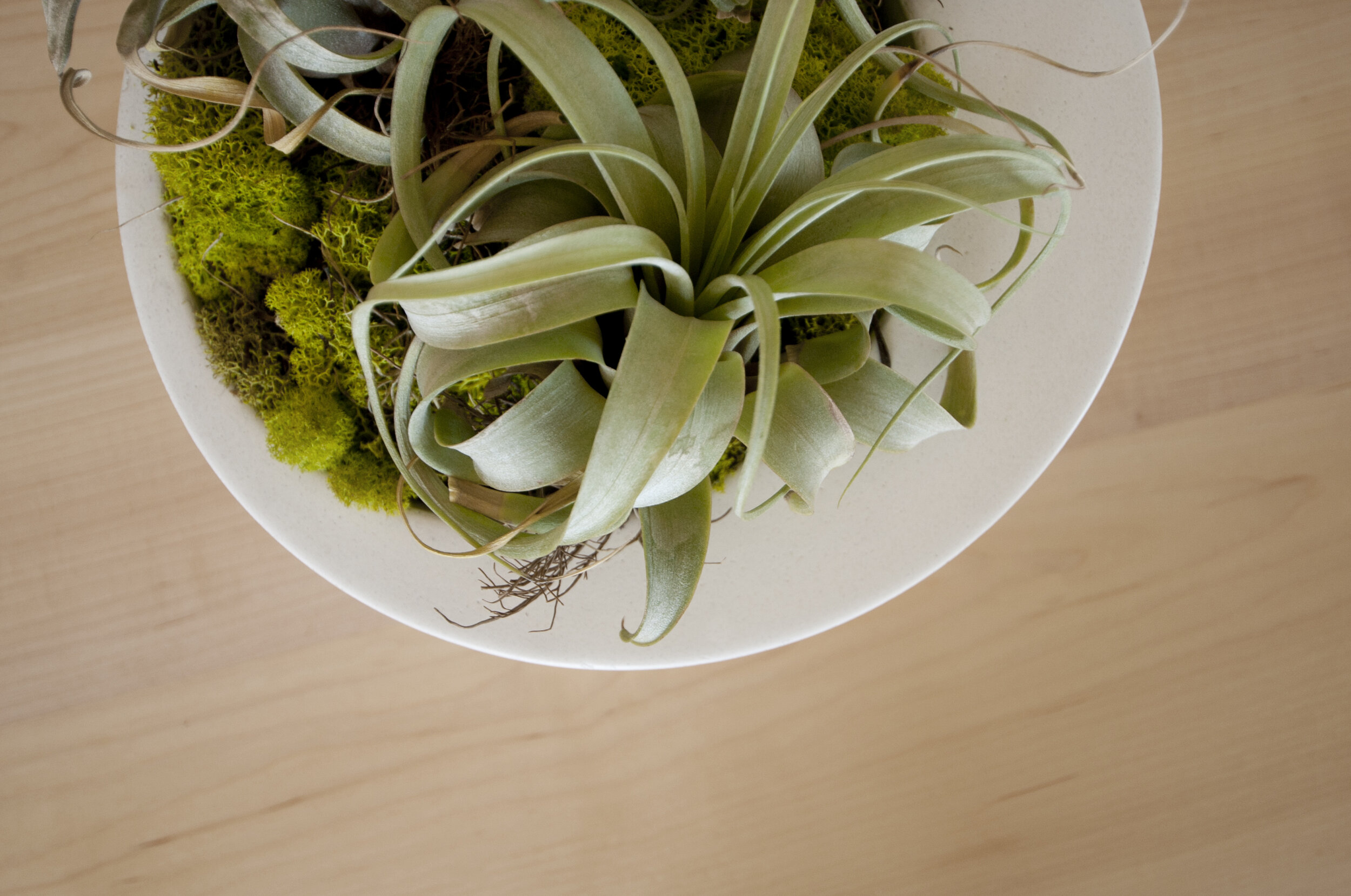
My work as a LEED and WELL-accredited home designer is deeply rooted in wellness and biophilia. Biophilia is our innate desire to be close to nature, and biophilic design aims to create healthy and comfortable interiors by meaningfully incorporating natural elements into our home and work environments. Integrating Classic Blue into our spaces builds on the principle of biophilic design because of its presence in nature.

beachy bachelor (31).jpg

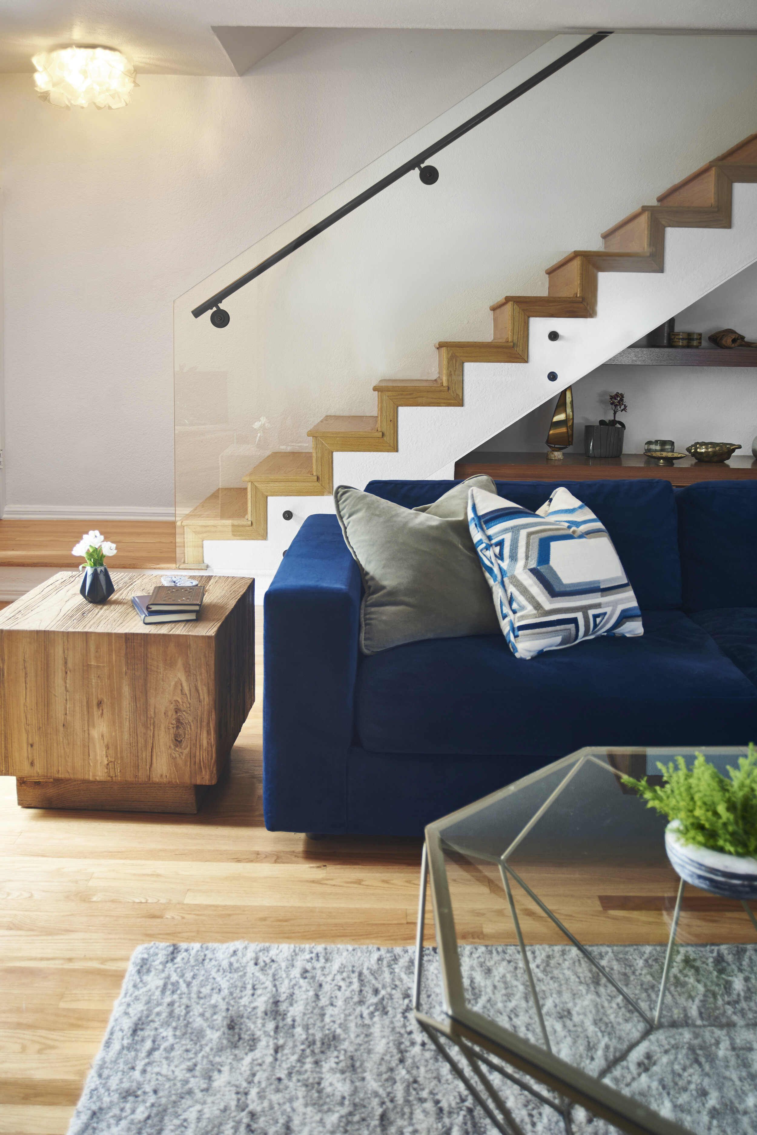
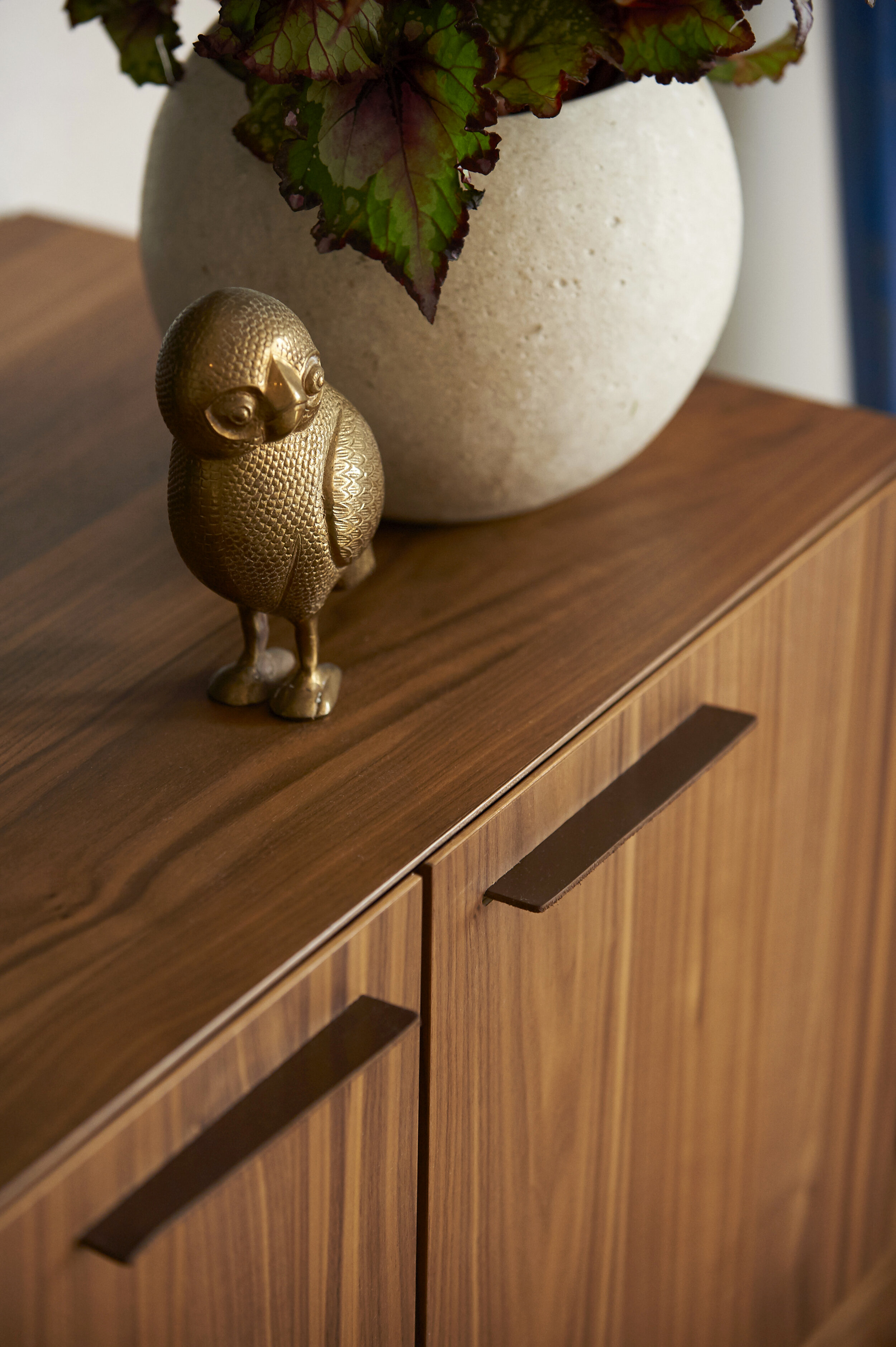
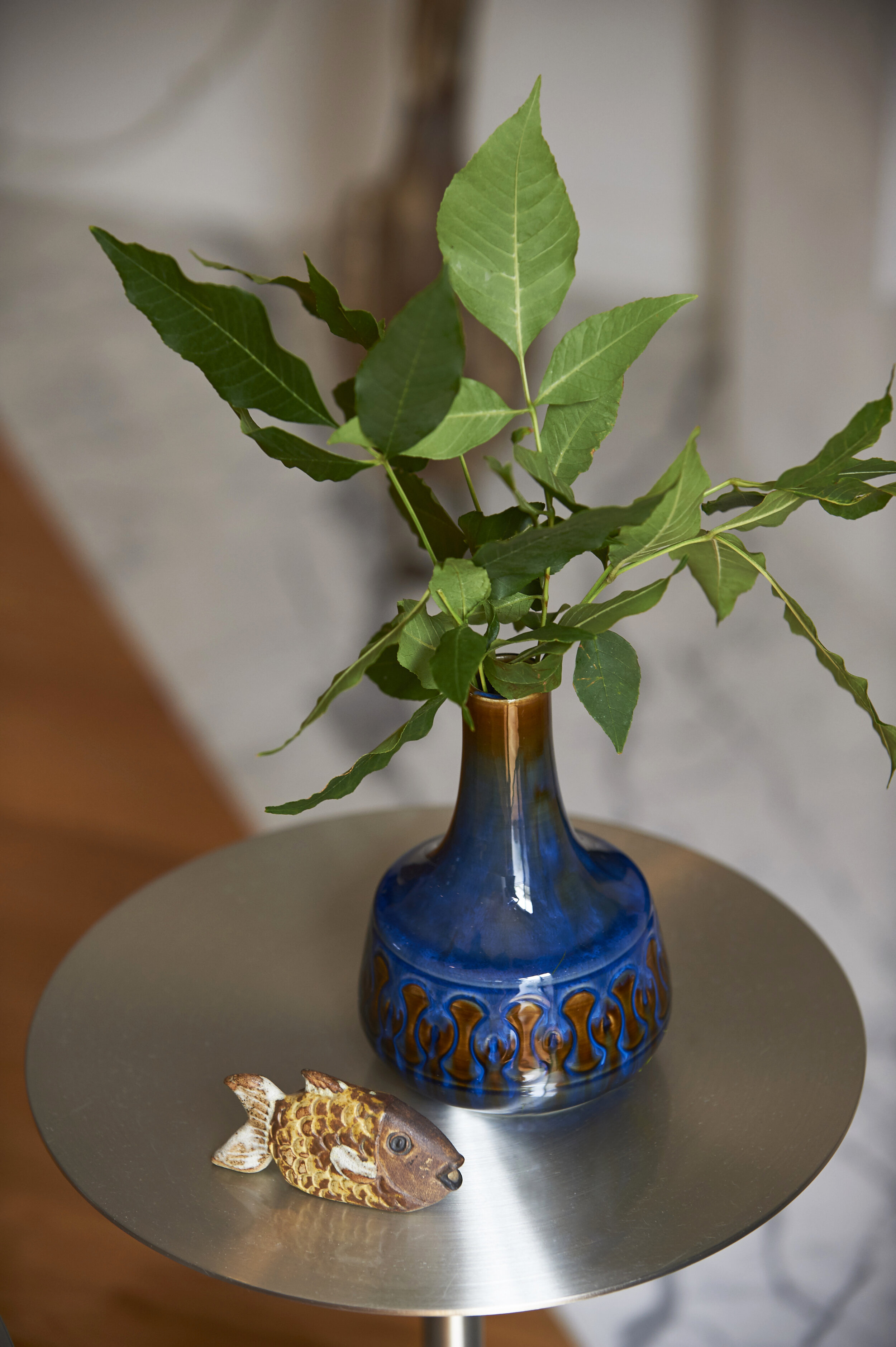
Art, textiles, furniture, and accents are all great ways to introduce soothing Classic Blue to your home or office. A project I recently completed features oceanic shades of blue that act almost like neutrals. I took inspiration from the home's beachy surroundings, bringing in a Classic Blue velvet sofa. I then repeated the color through vintage ceramic vases, books, and toss pillows.

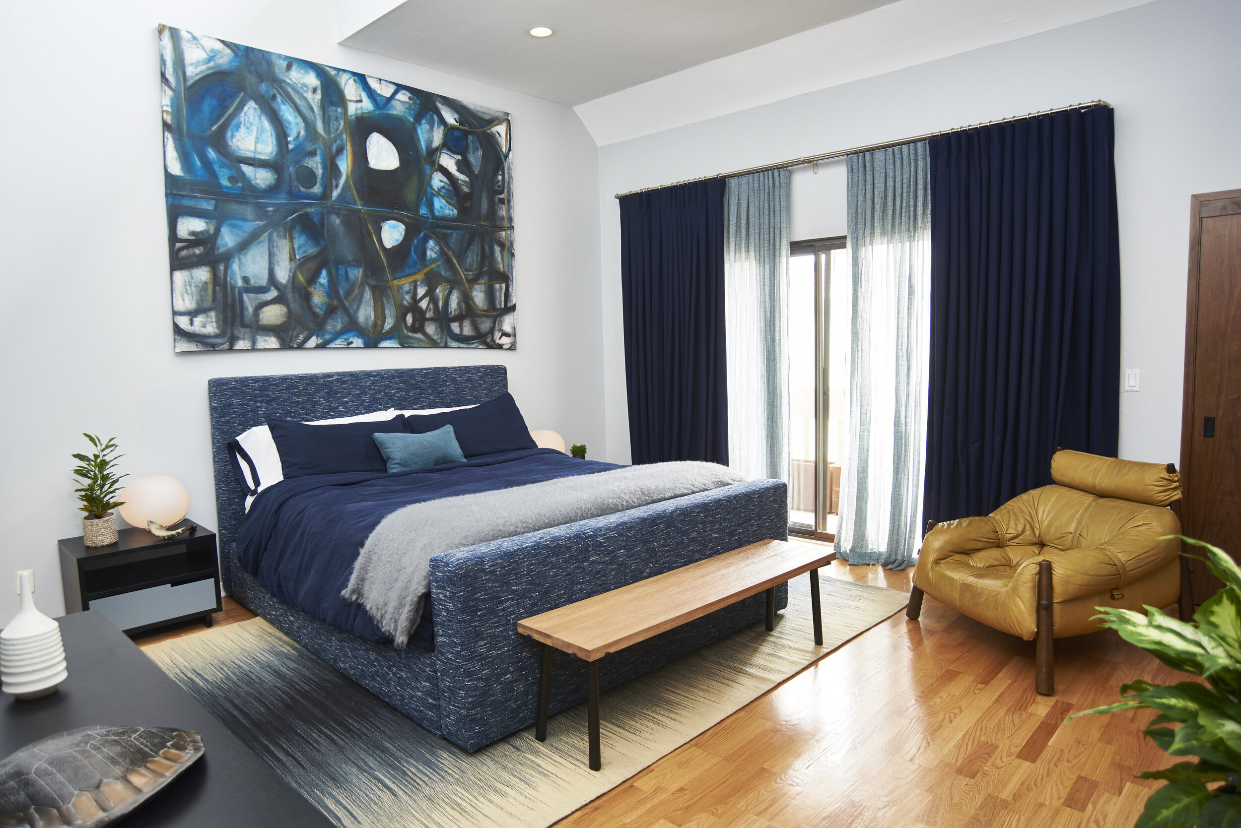
When acting as a base layer, Classic Blue can be paired with a multitude of colors, including other shades of blue. For the client's bedroom, I selected a handmade upholstered bed, Belgian linen bedding, wool drapery, and an abstract painting by Jonathan Elder, all wed by various blue tones. The buttery vintage leather chair and wooden bench at the foot of the bed complete the space, providing visual warmth and balance.

Consider adding serene, calming, earth-focused tones to your home in the new year. Whether you choose Classic Blue as an all-over hue or an accent, you can't go wrong with a color that takes its cues from nature.

Sarah Barnard, WELL AP, and LEED AP specializes in creating calming restorative environments that support physical, emotional, and mental well-being. Her interior design practice centers around her client's health and wellness while incorporating natural elements into every space she designs.