Interior Design Renderings: How Photorealistic Drawings Enhance Home Remodeling and Decorating

Rendering of grey kitchen

Rendering

Built design

When designing a new space for a client, one of the clearest ways to help illustrate what the interior design may look and feel like is through renderings.

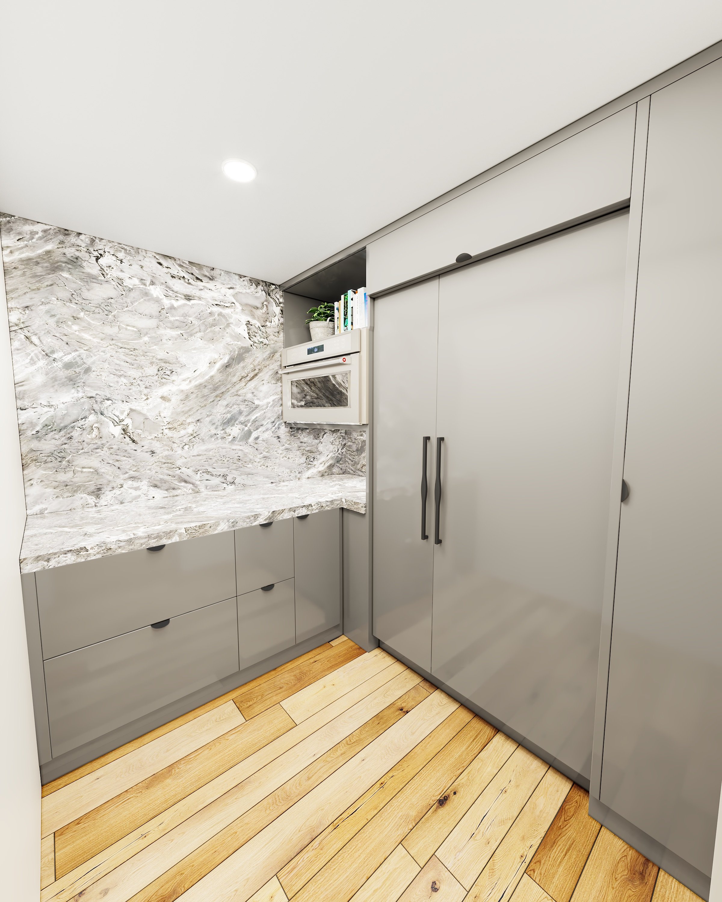
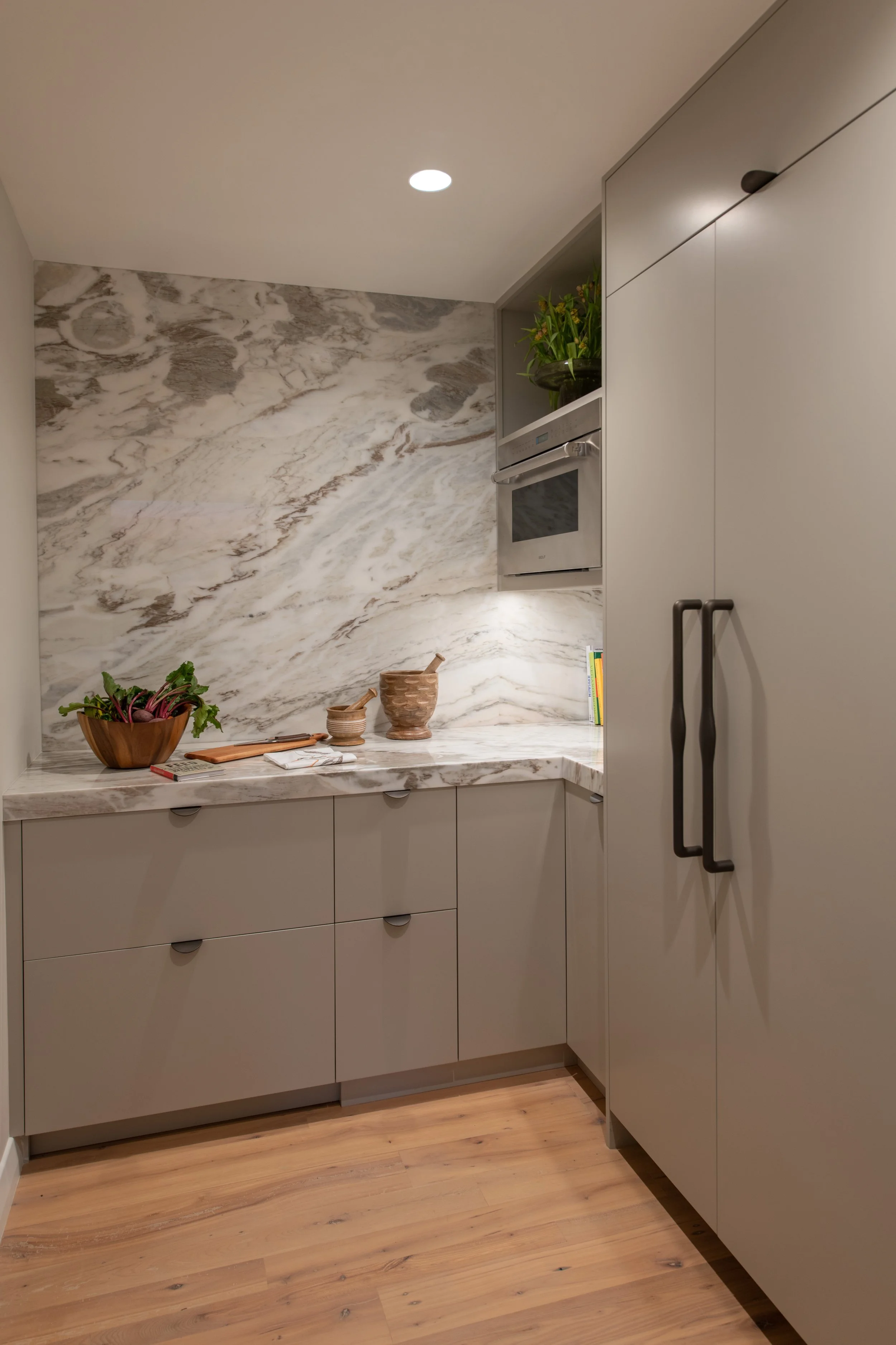
Grey pantry rendering

Rendering

Built design

In the rendering process, designers take information from AutoCAD files and apply the selected materials to create a realistic drawing that can help clients envision the final design.

AutoCAD Drawing of a half bath

Autocad drawing

Rendering

Built grey half bath

Built Design

While the AutoCAD files can share many crucial project details, having a 3D rendering can help illustrate how materials are working together and envision how the layout may affect the experience of being in the space.

A brown, white and grey modern bathroom with marble hexagon tiles, wooden vanity and moth door handles.

Rendering

Copper toned bathroom built design

Built design

This additional information and understanding can help clients recognize any aspects of the design they may want to change before the construction process.

Grey marble kitchen rendering

Rendering

Grey marble kitchen built design

Built design

While it's possible to complete a project without renderings, they add immense value to the design process, visually communicating designs with clarity, contributing to positive design outcomes and our client's happiness and satisfaction.

Sarah Barnard, WELL AP + LEED AP, is a leading designer of personalized, sustainable spaces that support mental, physical, and emotional wellbeing. An advocate for consciousness, inclusivity and compassion in the creative process, Sarah’s work has been recognized by Architectural Digest, Elle Décor, Vogue, HGTV, and many other publications. In 2017 Sarah was recognized as a “Ones to Watch” Scholar by the American Society of Interior Designers (ASID).

The Inclusive Kitchen: Universal Home Design Improves Quality of Life

Interior Design by Sarah Barnard. Photos by Steven Dewall. Originally published in LADESIGN Quarterly, by the Los Angeles chapter of the American Society of Interior Designers.

Interior Design by Sarah Barnard. Photos by Steven Dewall. Originally published in LADESIGN Quarterly, by the Los Angeles chapter of the American Society of Interior Designers.

Universal home design is intended to improve the quality of life for all users, regardless of age or ability. When applied to the kitchen, these principles should ensure safety, efficiency, and comfort. The term was first coined in the 1970s by architect and disability rights advocate Ronald Mace. Since then, universal home design practices have been rising steadily due to its inclusion in formal design education and support from professional associations like ASID, who provide research and case studies for universal design and aging in place.

In my practice, as a WELL and LEED accredited designer specializing in healthy, sustainable interiors, I often find that planning for the future can be intimidating for clients, but doing so ensures they will be happy spending a lifetime in their homes. 

I recently completed a home remodel for a retiree, who wanted the kitchen to function well when cooking for one. However, she often hosts friends and family, so it also had to be designed with entertaining in mind.

MinimalKitchen-5.jpg

Knowing the kitchen would be widely used, we considered universal home design principles to increase its functionality. The aesthetic was inspired by the cool, collected nature of the home's coastal locale and the utility and simplicity of Scandinavian design.

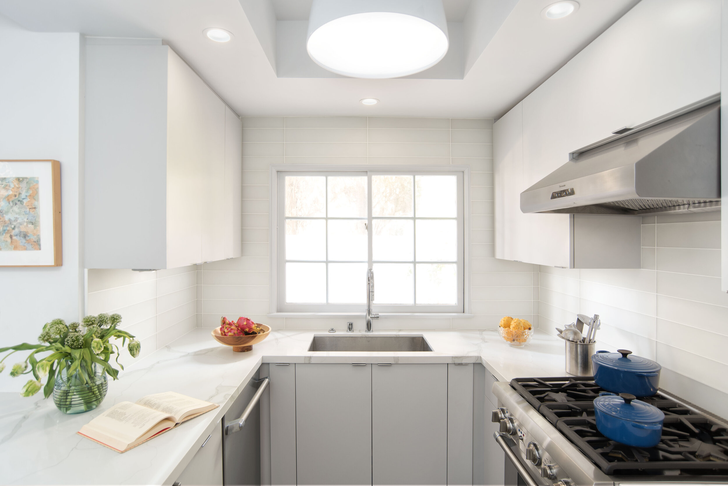
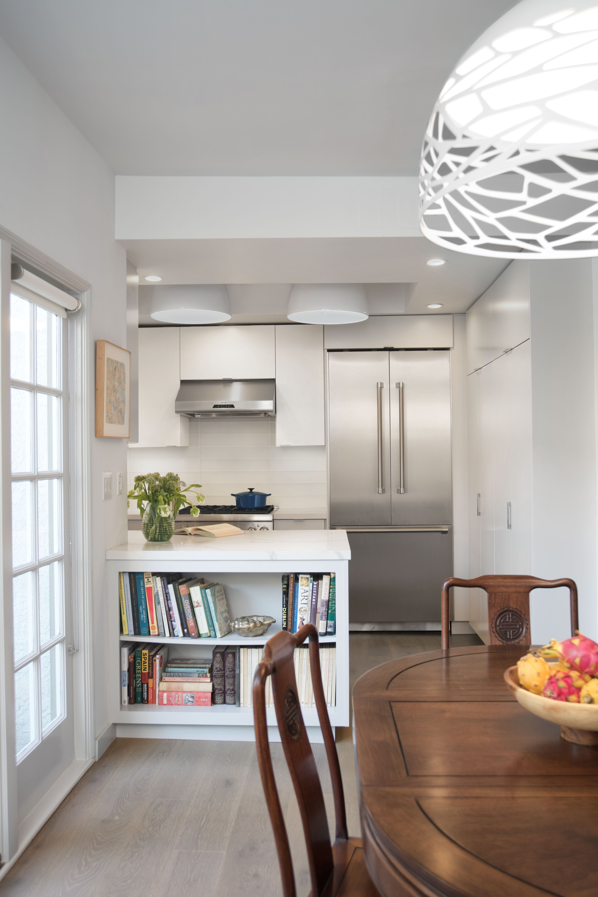
I specified a U-shape layout to provide unobstructed traffic flow and ample counter space. The kitchen is open to the dining area, and there are no barriers, such as steps or a doorway, to separate them. It's a confined space, which reduces the amount of back and forth travel. 

I find that most clients are unwilling to plan for a mobility challenge they may never have. While we can't always get them to agree to a design that accommodates a wheelchair, clients are often comfortable with a clearance of 54 inches for mobility aids such as a walker or cane. If designing for wheelchair mobility, knee to toe clearance allows for easy access.

NeutralKitchen10.jpg

I used both upper and lower cabinets to give the homeowner plenty of storage. Keeping countertops clear, in turn, mitigates safety risks. The slide-out drawers are gentler on the back — she doesn't have to bend over or reach up high to access what she needs.

A large window provides views of the outdoors and welcomes natural light. Connecting with nature, even through a window, positively impacts our wellbeing by reducing blood pressure, slowing down our heart rate, and alleviating stress. Natural light, combined with the recessed lighting and oversized pendants, relieves eye strain and helps the homeowner safely perform tasks like chopping or peeling. 

For the hardware, I chose large, integrated pulls instead of knobs because they're easier for stiff or shaky fingers to grasp. According to the Centers for Disease Control, 54.4 million Americans are affected by arthritis, the majority of whom are 65 and older. While a knob requires the user to bend their fingers to latch onto it, a cabinet with a pull can be opened with limited dexterity using only one or two fingers. 

Minimalitchen-8a.jpg

The homeowner preferred a single-lever faucet; however, if increased accessibility is the primary concern, touch-less faucets can be an excellent alternative. Clients may be hesitant to select this high-tech feature if their experience has been limited to unreliable public restrooms. Fortunately, more and more stylish options for residential spaces are becoming available. 

If the homeowner were to change her mind, the electrical components could be concealed in a base cabinet or behind an access panel. It's essential to consider your surroundings when installing a touch-less model as some products will not operate correctly if they are in proximity to other metals, like a copper sink or stainless-steel backsplash.

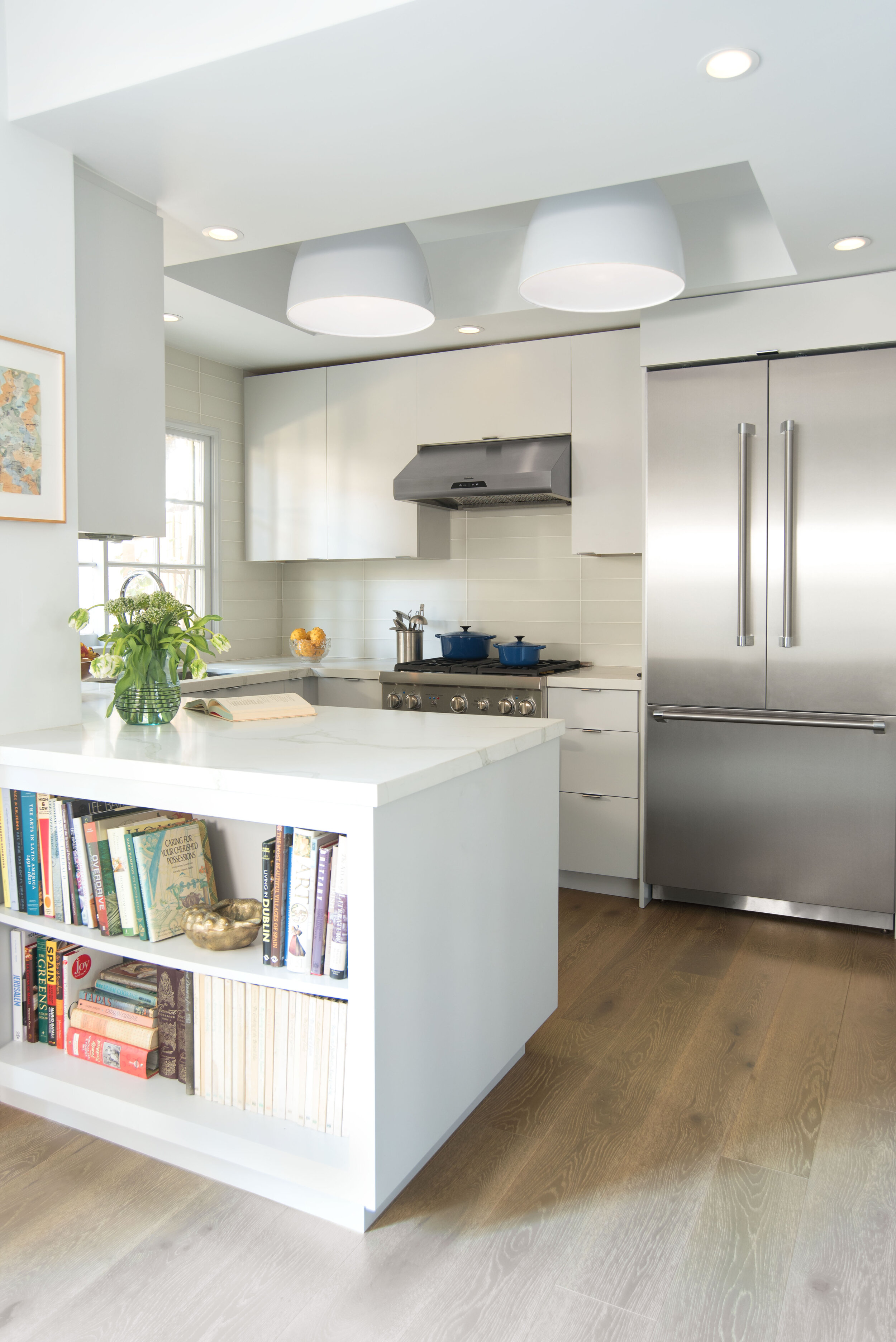
The French door refrigerator can be opened without much exertion thanks to its oversized pulls, and the efficient design means everyday ingredients are displayed for easy access. It has a well-lit interior to aid those with vision loss.

The kitchen countertop is white engineered quartz with subtle gray veining. This human-made material is durable and stain-resistant, requiring less maintenance on behalf of the homeowner. People with impaired vision will be better able to identify the kitchen tools and ingredients in front of them, as the brilliant white creates high contrast. I sourced a cream-colored matte glass tile backsplash to prevent surface glare.

Natural French oak flooring was used throughout the open-concept space, eliminating any unsafe transitions. The material has a matte finish and was designed to be slip-resistant — an absolute must in the kitchen where spills are common. It also feels comfortable underfoot and has more spring to it than other flooring types, which is easier on the joints.

Open shelving on the back of the peninsula adds a pop of color to the space. This bookshelf created an opportunity to display some of her most treasured collectibles, which spark joy each and every time she sees them.

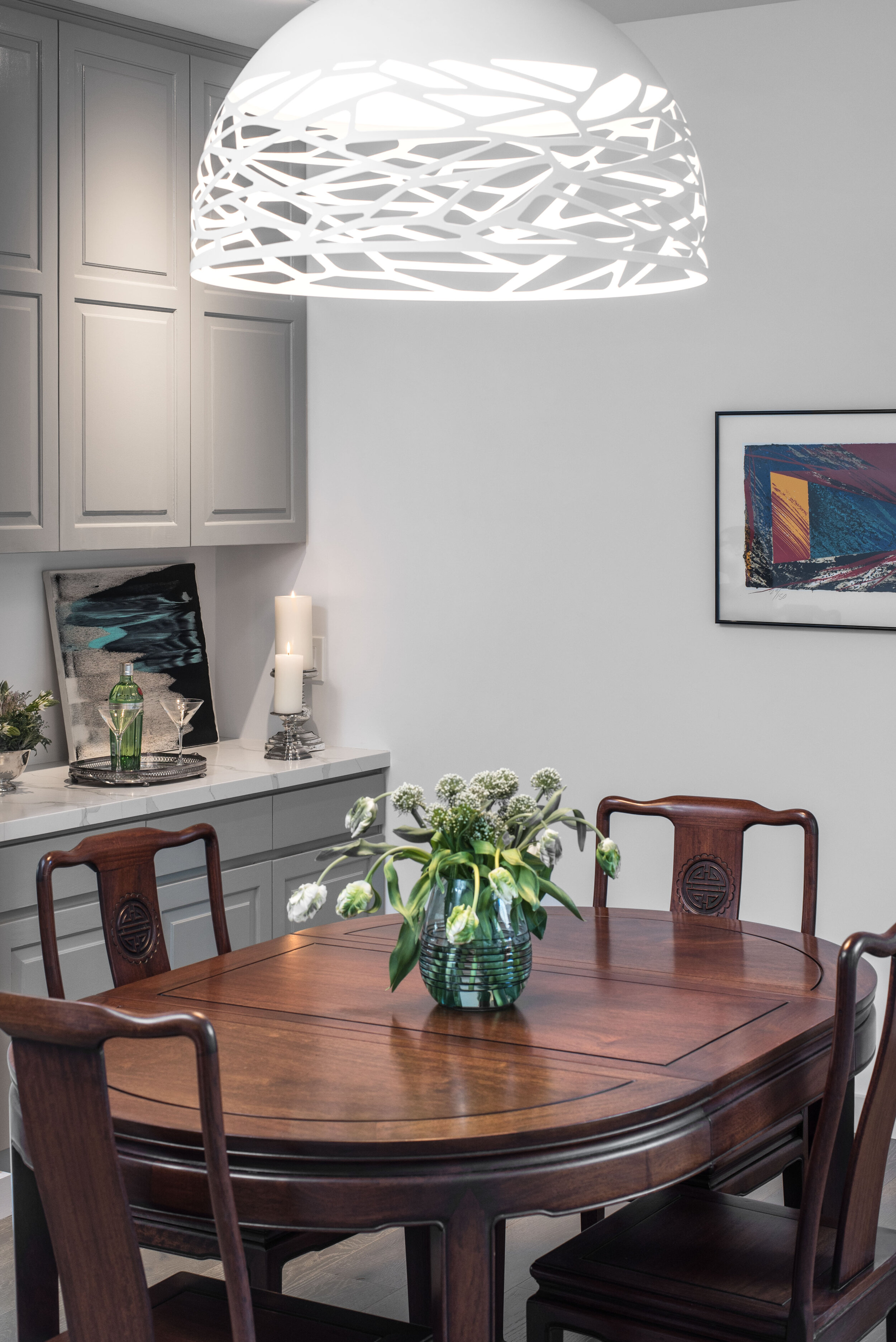
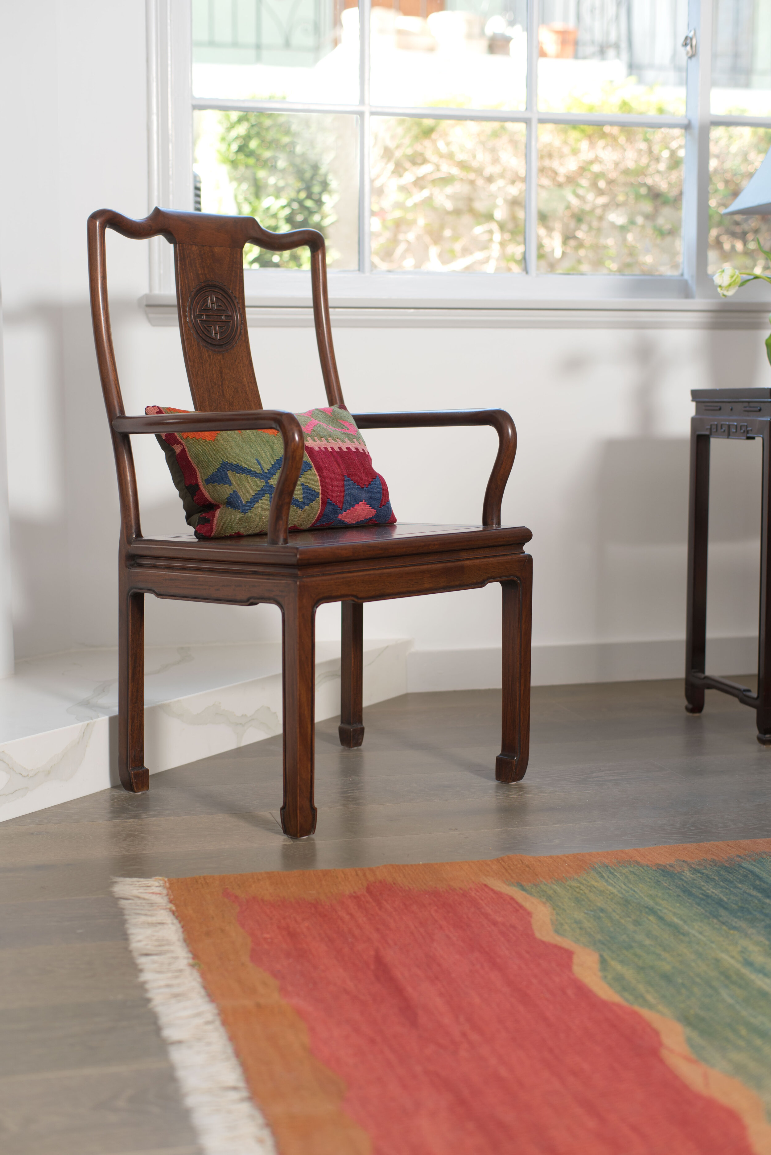
The antique rosewood dining table, sourced from Thailand by the homeowner, is located within close reach of the kitchen, so heavy platters of food needn't be carried far. The open floor plan makes it easy to converse with guests who are seated at the table while she's whipping up hors d' oeuvres in the kitchen. The built-in server provides an additional surface to set down dishes and clears up the dining table to prevent any accidents.

Universal home design can and should be both stylish and seamless. Reexamine the products, materials, and finishes you already use, and consider how they might be implemented in a way that supports people of all abilities. With this project, the homeowner was conscious of her potential future needs and entrusted us with creating a healthy, natural, and minimalist space that would suit her well in the long-term.

Sarah Barnard, WELL AP, and LEED AP designs healthy, happy, personalized spaces that connect deeply to nature and art. Empathy and mindfulness are the foundation of her practice creating healing, supportive environments that enhance life.

Historic Craftsman Bungalow: Heineken Green Kitchen

Sarah-barnard-design-modern-recycled-kitchen.jpg

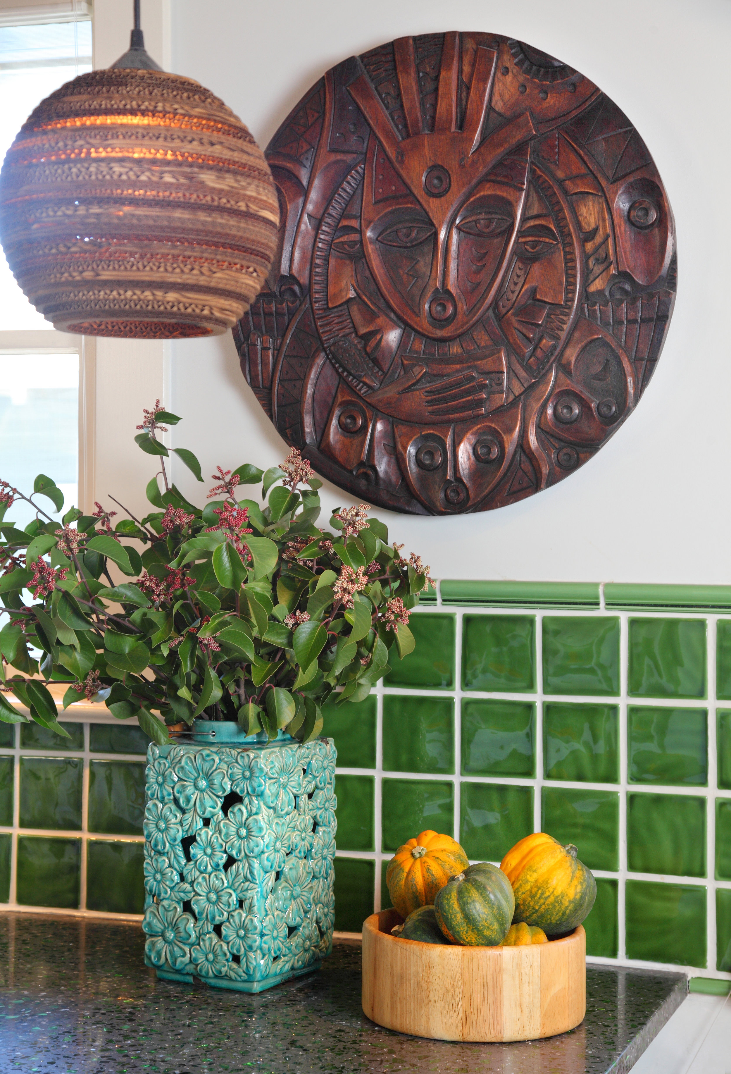
This bright bungalow features a custom remodeled kitchen with a collection of handmade elements reflecting the homeowners love of nature and commitment to sustainable materials. Locally made cabinets, countertops made with recycled Heineken bottles, handmade ceramic backsplash tile, and cardboard pendant lamps make for a truly unique space.

This cook's kitchen has a place for everything and everything in its place! Built-in wall shelving provides extra space for storage and creates a cheerful display of dishware and other kitchen utilities.

A hard-working home office tucked away in the corner of the kitchen. Custom designed to fit the compact space perfectly, this corner nook gets plenty of natural light. A countertop made from recycled bowling alley lumber makes the utilitarian space special! Framed artwork by Gwen Samuels adds unique handmade detail atop the desk.

Sarah-barnard-design-modern-home-office.jpg

Sarah Barnard designs healthy, happy, personalized spaces that are deeply connected to nature and art.

To learn more about Sarah Barnard Design, please visit www.SarahBarnard.com.

Photos by Chas Metivier