Designer Sarah Barnard on Why Empathy Is Central to Her Work

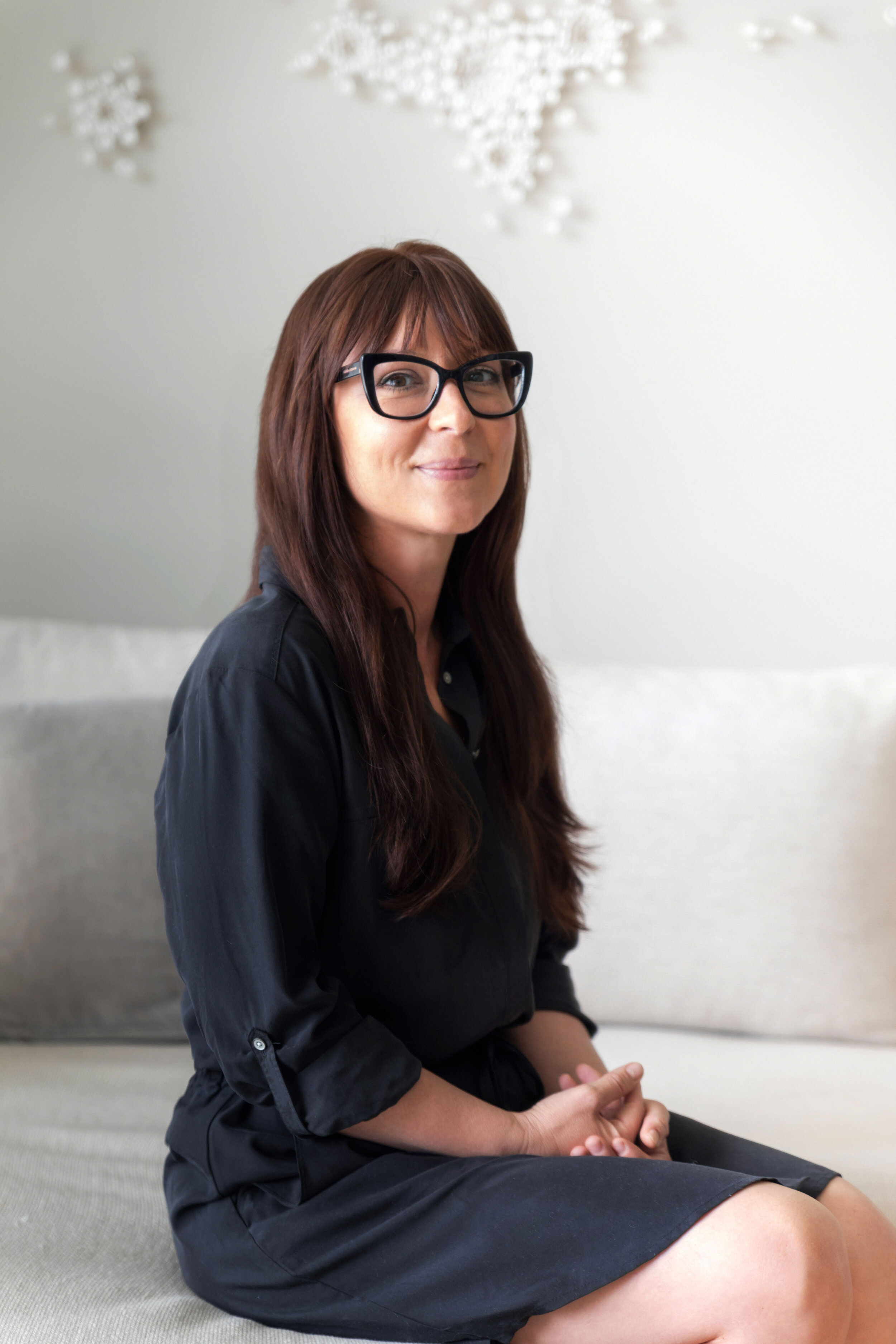
sarahportraitresize.jpg

Article by Gwendolyn Purdom, originally featured Houzz.

Growing up with historic preservationist parents, Sarah Barnard got her introduction to architecture and home design at a young age.

“I grew up in historic homes, and my father was restoring furniture and light fixtures and stair railings and you name it,” the Los Angeles interior designer says. “Certainly, as things progressed in life, I think his talents became mine.”

The experience also shaped the way Barnard now approaches her work as the principal designer at Sarah Barnard Design — a firm built on sustainable, wellness-focused and otherwise mindful practices. (Barnard is a WELL accredited professional, a Building Biology practitioner and a LEED accredited professional.)

“Reducing, reusing, recycling — these types of things were not novel concepts,” Barnard says. “Being sensible and responsible in our choices and in our material specifications is something that’s always been a part of my life and definitely influences the way that I work.”

Barnard, who has been using Houzz to share project photos and to connect with fellow professionals on Pro-to-Pro discussion boards almost since the platform launched, has been seeing more and more clients, parents particularly, looking at their homes through a more thoughtful, holistic lens. Beyond being environmentally conscious, Barnard’s home design projects revolve around creating spaces that are personalized to support mental and physical health and happiness.

“If we all could be so lucky to exist in a space that is uniquely ours,” Barnard says. “There really is no happier environment than a space that is specially made for you.”

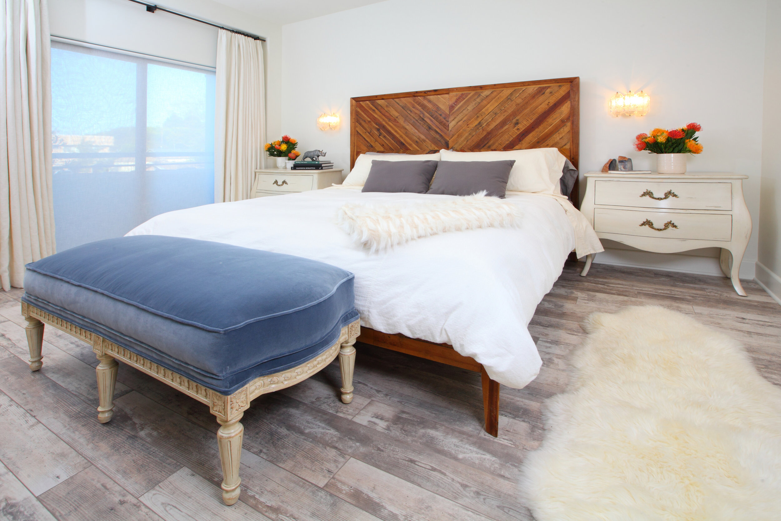
PHOTO BY: CHAS METIVIER

PHOTO BY: CHAS METIVIER

Q. You specialize in wellness design, sustainable design, and other mindful design practices. Why did you choose to make those specialties central to your work?

A. Empathy is really the foundation of our studio’s practice. Being able to meet our clients where they are and create environments that support them in living their best lives is really the heart of what we do.

My two primary credentials are LEED AP [accredited professional] and Well AP. LEED focuses more on environmental responsibility. WELL is focused more on human health. Those two things, along with historic preservation, really are the key focuses of my practice.

PHOTO BY: STEVEN DEWALL

PHOTO BY: STEVEN DEWALL

That said, the personalization piece is really where it’s at in terms of being able to adapt to a broad range of situations. Sometimes that is a client who is seeking a vegan or perhaps a sustainable and vegan environment.

Other times it might be something that’s more of a specific family need, like a child with developmental differences or a person who has 13 cats. Any personalized need that could be better accommodated through home design is something that we’re keen to help with.

PHOTO BY: STEVEN DEWALL

PHOTO BY: STEVEN DEWALL

Q. How do you work around challenges those specialties may present?
A. There are always limitations, and one thing we learn as design students and we practice throughout life is that limitations really drive design. With a big, broad, open scope the outcome could be anything, but the more limitations the project has to endure, the more specific the outcome.

An example of that is that we have a client who utilizes a prosthetic leg, and of course, this is something that is integral to her day-to-day function but not something that she would like to draw attention to. In the process of designing her home, it was disclosed at some point that she didn’t want certain types of textiles that would make it difficult for her to get up or get down. Something that might be more slippery, for example.

So, something that we may not have been aware of at the start of the project — once we’re armed with the information of what specific textures are going to be safest for her, then we can proceed accordingly in recommending those well-matched solutions.

PHOTO BY: STEVEN DEWALL

PHOTO BY: STEVEN DEWALL

Q. Where do you find inspiration?
A. On a personal level, I’m definitely very much connected to the natural world. For me, that means spending time in my garden, doing a heck of a lot of birdwatching, really being tuned in to the small daily differences — like what the birds are doing, what the plants are doing, what the caterpillars are doing.

Being in touch with what’s going on in the natural world is a really important way for me to stay grounded in my professional life. Those textures, colors, patterns, things that I experience in the outdoors definitely drive the solutions that I create indoors.

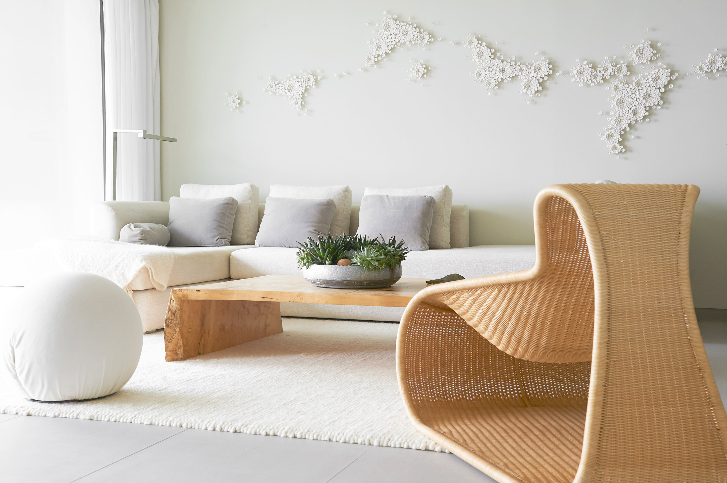
PHOTO BY: STEVEN DEWALL ARTWORK: KEVIN MOORE

PHOTO BY: STEVEN DEWALL ARTWORK: KEVIN MOORE

Q. What has been your most memorable client request? You worked with someone with 13 cats?
A. Yes. We made a special screened porch for the cats so that they could enter and exit the house safely without being eaten by a coyote or disturbing the neighborhood bird population. They were able to bask in the sun and live their happy lives safely and in a way that made the homeowner pleased.

I think perhaps the most fun request we’ve had in the last few years was that a young couple in the entertainment industry wanted an adult sleepover room. It was a very large space that would essentially have multi-functions for hosting parties, but the sofas would be modular and movable so that they could be reconfigured as king-sized beds. And if the party got late and movie-watching turned to sleep, 10 or more couples could camp in this room.

PHOTO BY: STEVEN DEWALL

PHOTO BY: STEVEN DEWALL

Q. Is there one particular project that changed your business in some way?

A. In my late 20s, I had the opportunity to design the West Coast offices for National Geographic Entertainment. And that certainly was an important project for us, because it was not only aesthetically in our dream wheelhouse, but it also was a client that more than ever before really was in alignment with our values and the things that we think are important. That definitely was a fantastic experience.

PHOTO BY: STEVEN DEWALL

PHOTO BY: STEVEN DEWALL

Q. What advice would you offer to pros who want to make their practice more sustainable or mindful?

A. The most critical skill in mindful design is listening — creating a space in which the client feels comfortable to share, and then really listening and asking follow-up questions, many of them, prior to offering any solutions. Probably the most common rookie designer mistake I see is, designers, want to view a space and immediately make recommendations. And in doing that they would have missed the most critical element of the space, which is the user.

PHOTO BY: STEVEN DEWALL

PHOTO BY: STEVEN DEWALL

Q. What particular challenges is the interior design industry facing?
A. Interior designers have always had a singular challenge, which we will probably face for decades to come, and that is that many homeowners don’t actually understand what we do. Because of this sort of lack of education in the homeowner, they may misunderstand our services to be shopping. They may misunderstand our services to be a number of things that are not actually what interior design practice is fundamentally about. And because of this misinformation, I think designers may struggle to communicate their value to a person who perhaps hasn’t worked with a designer before or isn’t familiar with all the benefits a professional can bring to a project.

Because I have been in the game most of my adult life, I am fortunate to be approached regularly by clients who are knowledgeable, who do value what my team has to offer. I think in the rare occurrence where we’ve worked with a client who struggles to understand the process, we just remain patient and explain to whatever length necessary so that they can understand what is happening and why.

A great example of that would be, I had a client once and he said he didn’t need measuring; he just needed furniture. That’s an example of someone who just doesn’t understand the steps of the process. Being patient with him and explaining to him why measuring is critical to the process allowed him to remain in support of the work that we were doing and understand what we were delivering and why.

PHOTO BY: STEVEN DEWALL

PHOTO BY: STEVEN DEWALL

Q. What advice would you offer other pros on making their own design specialties stand out?
A. It’s like the advice that our moms all gave us as children, but it’s critical to be yourself — thinking about what’s really important to you and what are the things that you really, really are passionate about and being more a part of those things.

For example, for me, it’s nature and birds and that’s my truth. It’s easy for me to talk about nature and birds because that is my real life. It’s much more difficult to try to follow the trends of others and latch on to boho-chic or whatever is the latest thing. Because if the latest thing is not your thing, it’s never going to be authentic anyway.

sarah barnard pp (12).jpg

Sarah Barnard designs healthy, happy, personalized spaces that connect deeply to nature and art. Empathy and mindfulness are the foundation of her practice creating healing, supportive environments that enhance life.

Unpacking the “KonMari” trend: The personalization of ultra-home organizing

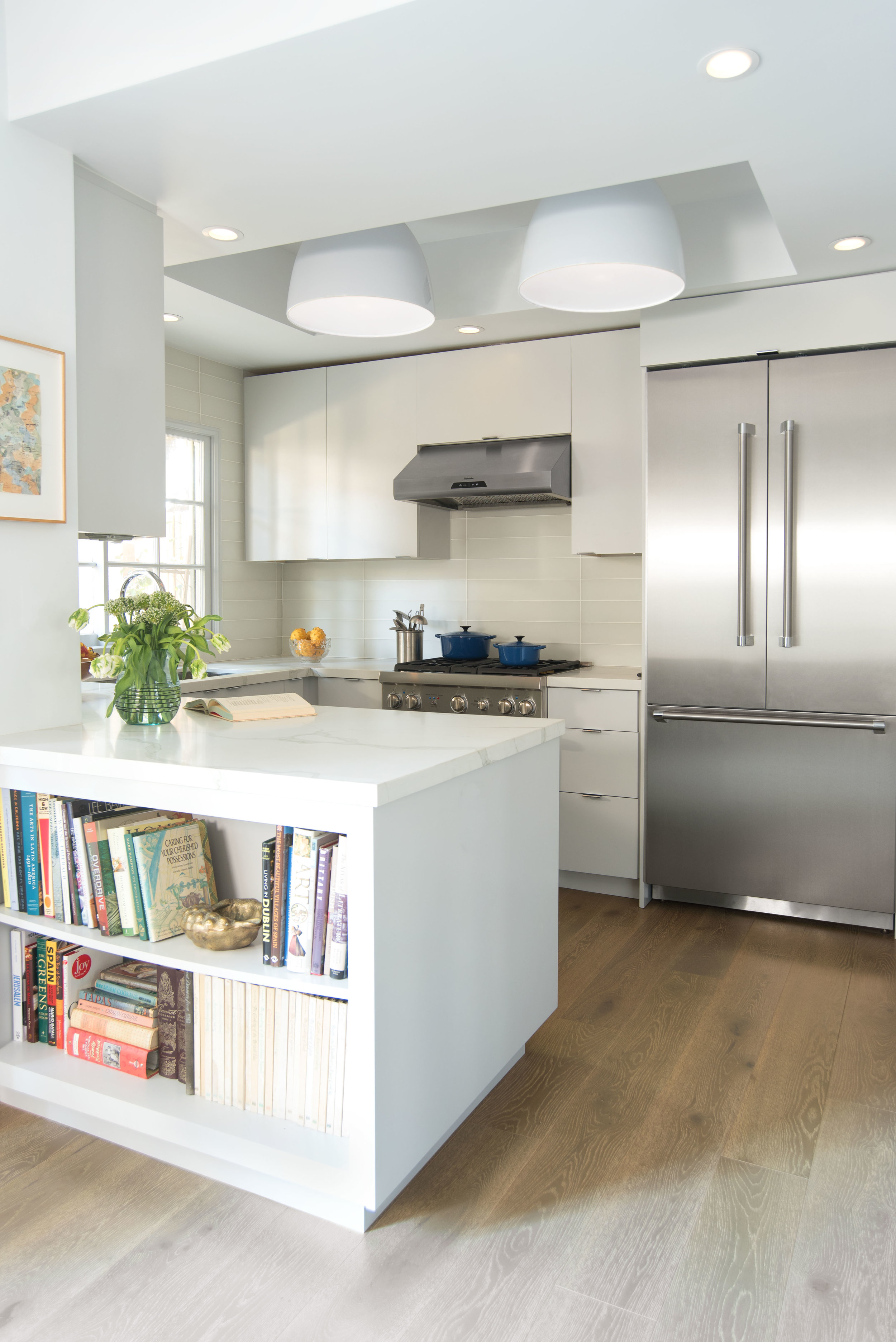
A tidy, minimalist kitchen in with open shelving to keep cookbooks close at hand.

A tidy, minimalist kitchen in with open shelving to keep cookbooks close at hand.

Before Marie Kondo, there was William Morris, a renowned 19th-century British designer who lived by this philosophy: “Have nothing in your house that you do not know to be useful or believe to be beautiful.”

Kondo has a more stringent and less personalized approach. She encourages followers of her KonMari method to grasp each item in their hands and evaluate their body’s reaction to it. If it makes you feel uplifted, put it in the keep pile. If it causes you to feel weighed down, in the donation bin it goes. But here’s the thing — there’s no one-size-fits-all organizing method. Whether you prefer a pragmatic approach à la William Morris or Kondo’s emotionally-guided decision-making process, figuring out what works for you and your lifestyle is paramount.

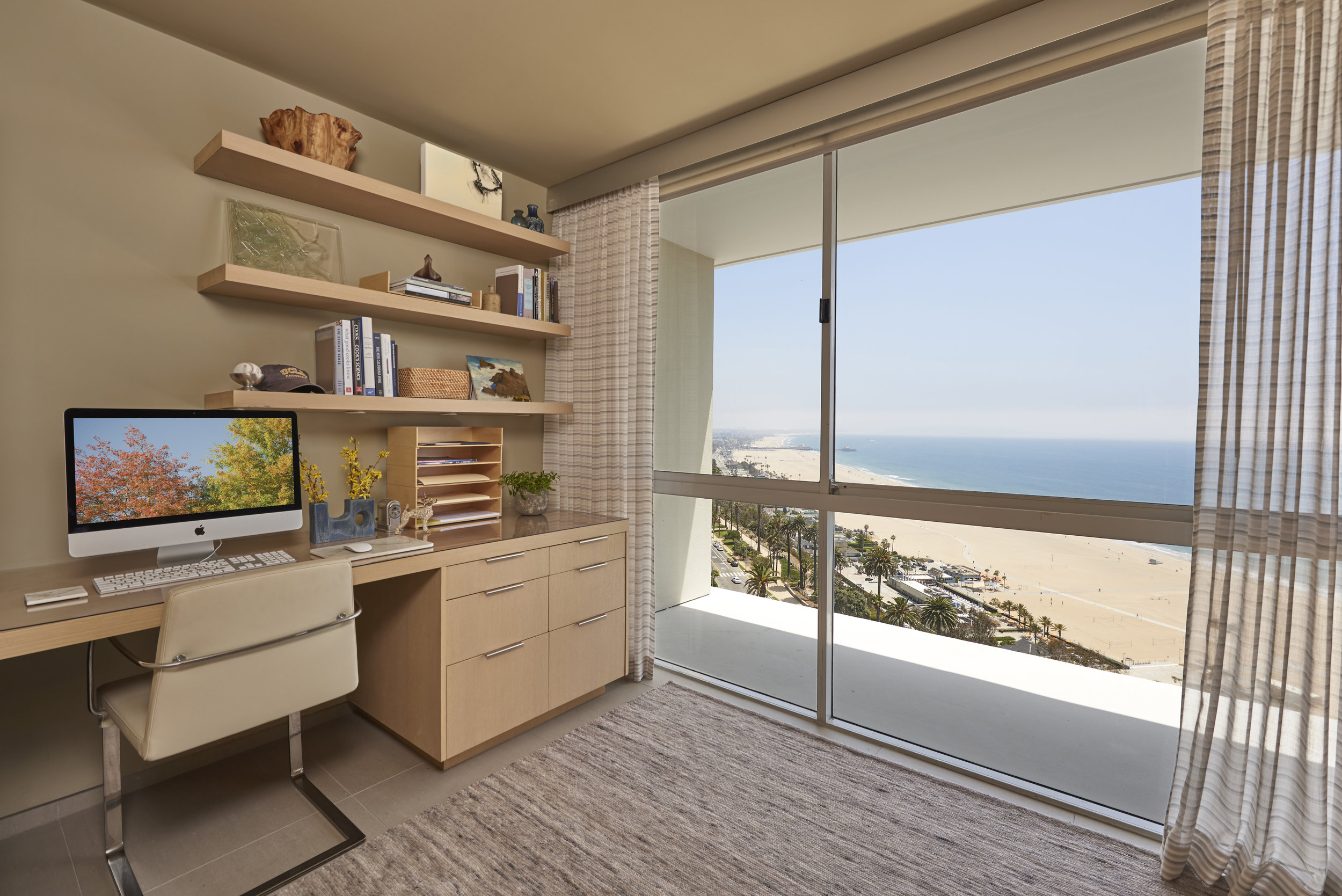
Floating shelves provide vertical storage in this compact home office featuring an impressive view of the shoreline.

Floating shelves provide vertical storage in this compact home office featuring an impressive view of the shoreline.

“The method of organization should support the client’s daily routine and activities,” says interior designer Sarah Barnard, who specializes in healthy, happy, personalized spaces. “What items do they use most regularly? How do they envision the space? Having a clear goal will start to inform the plan.”

Barnard provides organizing services for clients in every stage of life, from young professionals with little spare time to retirees with reduced mobility. “One of the main reasons people ask for our help is because they are overwhelmed and don’t know where to start,” explains Sarah. “Our goal is to streamline the process by setting up personalized systems that can be easily maintained.”

A tidy studio bookcase keeps favorite books close at hand. A painting by Abby Sin, sculpture, ceramics and antiques lighten and brighten the display.

A tidy studio bookcase keeps favorite books close at hand. A painting by Abby Sin, sculpture, ceramics and antiques lighten and brighten the display.

Sarah recently tackled a two-week-long organizing project for a busy family of five. Recognizing that the experience can be quite invasive, Sarah and her team went to great lengths to ensure the family felt comfortable. Shoe covers were worn to prevent anyone from tracking in allergens, and cotton gloves were required when handling any personal items.

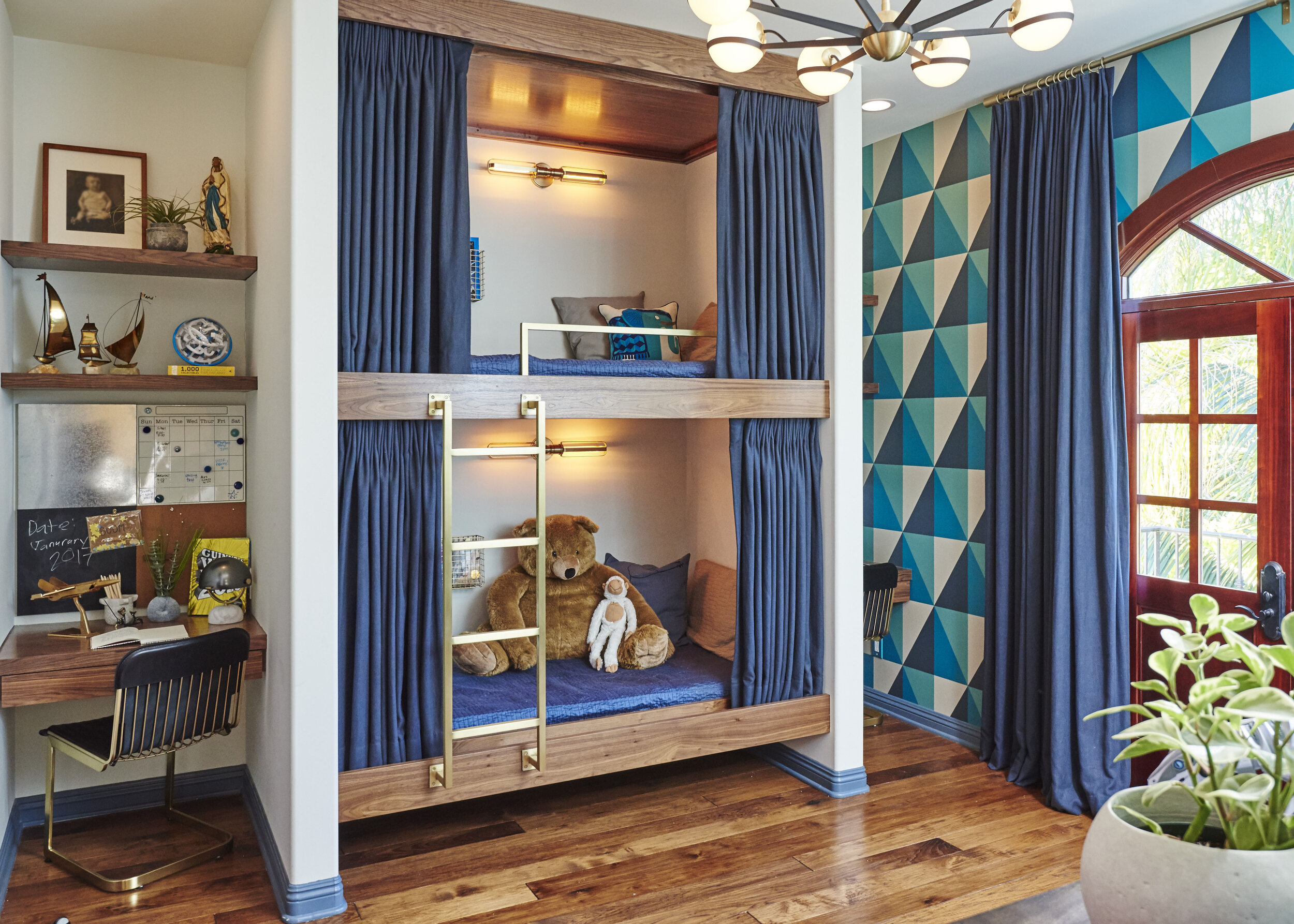
Very possibly the best boys' bedroom ever! Newly built walls allow for custom-made American walnut bunk beds and floating desks for each boy.

Very possibly the best boys' bedroom ever! Newly built walls allow for custom-made American walnut bunk beds and floating desks for each boy.

Clearing away unnecessary clutter was the family’s aim, and Sarah’s team employed the ‘keep, toss, donate’ method to get it all done. “We sorted our client’s clothing by season, removing the winter wear and storing it in the hallway closet,” says Sarah. “Now, primary closets contain only half the amount of items, making them more spacious and easier to navigate.”

Personalized tools for staying organized! Each boy's desk includes a utility wall with a chalkboard, pin board, metal panel for magnets and wipe off board calendar.

Personalized tools for staying organized! Each boy's desk includes a utility wall with a chalkboard, pin board, metal panel for magnets and wipe off board calendar.

In addition to freeing up closet space in the home, Sarah Barnard Design took on the organizing of a child’s craft room. “The client’s youngest son had received arts and craft gifts for each holiday of his young life,” notes Sarah. “This resulted in a wonderful collection, but also a lot of bits and pieces— to the point where the craft room was largely unusable.” The team carefully combed through his many art supplies, donating lesser-used items to create space for the most cherished ones.

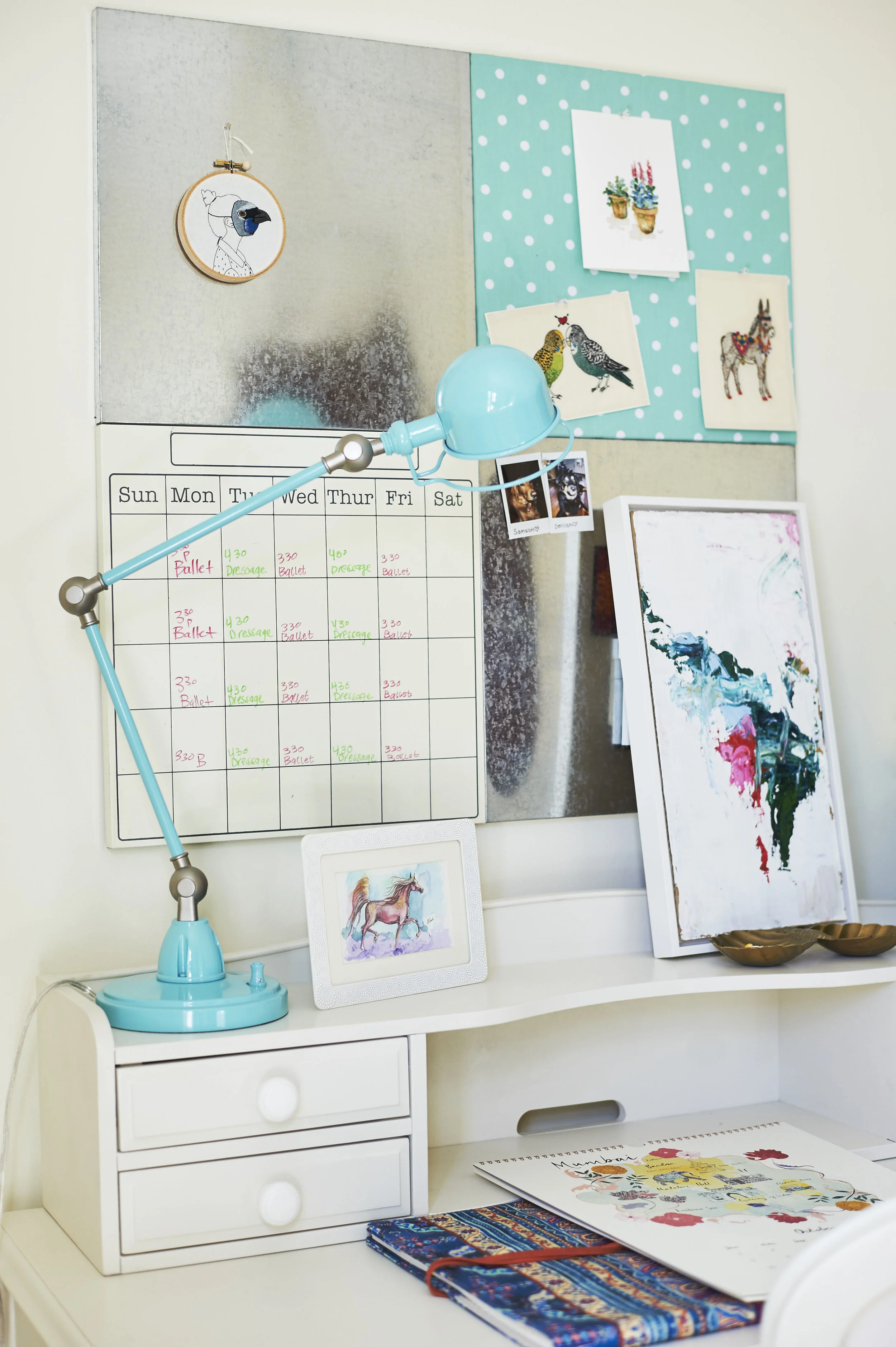
An articulating desk lamp adds a pop of aqua to the teen girl's study area.

An articulating desk lamp adds a pop of aqua to the teen girl's study area.

Once an organizing project is complete, Sarah’s clients have a renewed sense of self. Decluttering is a lifestyle change, but the benefits are well worth the effort. “It often inspires a newfound appreciation for their possessions and increased productivity in the space,” says Sarah.

A creative space with a custom sofa in wool felt, side tables made of natural maple and steel and a desk chair designed by Mauro Lipparini. Sculpture by Renae Barnard.

A creative space with a custom sofa in wool felt, side tables made of natural maple and steel and a desk chair designed by Mauro Lipparini. Sculpture by Renae Barnard.

Adopting a personalized approach to organizing will spark far more joy than bingeing an eight-part Netflix series and assuming your tidying habits will change through osmosis. Decluttering is hard, both physically and emotionally — it’s not something that comes naturally to most people. Seeking professional organizing help is an investment in yourself, saving you time, energy, and unnecessary stress. And hiring an expert to create customized systems that fit your lifestyle will help you stay organized in the long-term — no self-help books required.

Sarah Barnard designs healthy, happy, personalized spaces that are deeply connected to nature and art.

To learn more about Sarah Barnard Design, please visit www.SarahBarnard.com.

Photos by Steven Dewall and Chas Metivier

California Minimalism: Scandifornian Style By the Coast

sarah-barnard-design-minimalism-01.jpg

When a government executive from the east coast decided to retire, she knew it was time to finally make her home by the beach into the perfect restorative retreat. From a lifetime of travel, she collected an eclectic and beautiful array of art and antique furniture that needed to proper placement in the home she bought in the 1990s with her now late husband. She enlisted the help of Sarah Barnard Design to redesign the home, entrusting her with the task of blending the unique and personal pieces of the collection with a healthy, natural and minimalist style. Inspired by the light, bright and natural aesthetic of Scandinavian design, combined with the casual, collected aesthetic of coastal California.

sarah-barnard-design-luxury-minimalism-01.jpg

Sarah Barnard set out to create a home that was not only beautiful, but that would allow the owner to be comfortable indefinitely.  To achieve form and function in the kitchen, reordering the space to fit the clients’ lifestyle best proved to be the solution. An open-plan design was chosen to allow the owner to quickly cook, as well as to allow for easy entertaining of guests.

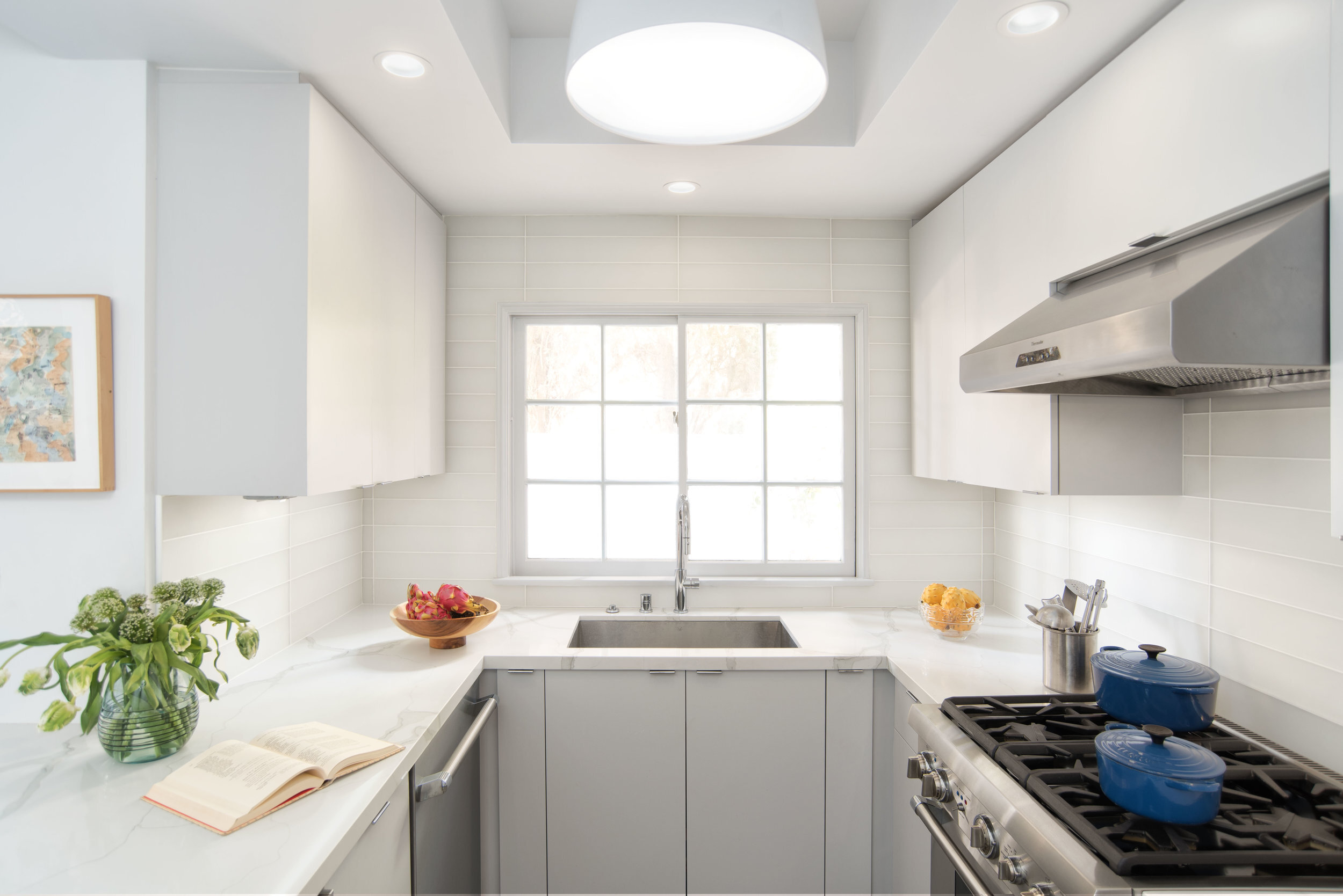
Sarah chose pale grey flat panel cabinetry to help the small space feel lighter and brighter. Matte white glass tiles were selected to add a quiet elegance to the minimal space. Once the project was complete, the homeowner gushed, “Entertaining here is much more pleasurable, as is cooking for one in my new kitchen.”

sarah-barnard-design-luxury-minimalism-01.jpg

The natural French oak flooring seamlessly connects the kitchen to the dining area, enlarging the sense of space in both rooms. Open shelving just outside the kitchen keeps cookbooks close and adds a sophisticated pop of color while stainless steel appliances were selected to pair with polished chrome cabinet hardware subtly. The simplicity of the color palette, the clean, natural materials, and the streamlined design created simplicity and new ease of use.

Sarah knew that repurposing the owner's treasured pieces would be essential in the home's re-design, so the owner's antique chairs and matching rosewood table from Thailand are placed prominently, bringing warmth and history to the contemporary dining space. The Italian chandelier above it contrasts the classic style and is made of laser cut metal and glass.

sarah-barnard-design-luxury-minimalism-02.jpg

In the living room, the original design included a sizeable diagonal bench that connected to the fireplace. The redesign eliminated this and other cumbersome architectural elements to create more floor space and a modern aesthetic. Sarah conceived a more straightforward hearth to feature art and items her client painstakingly collected. A serene white plaster fireplace with a Qortstone marble hearth now anchors the living room in a place where a traditional wood and stone mantle once sat.

sarah-barnard-design-luxury-minimalism-04.jpg

“I had not originally contemplated changing the living room fireplace wall, but I am delighted with the sleek new look Sarah achieved,” said the owner, who was also happy to have the perfect place for her paintings finally. “This oil painting, ‘Raspberry,’ previously hung in the stairwell between the second and third floors where its exuberant shapes and brush strokes could not be fully appreciated.” The painting, by Wendy Edwards, now hangs neatly above the fireplace.

sarah-barnard-design-luxury-minimalism--fireplace.jpg

A pair of dark stained wood coffee tables, also from the owner’s collection, were carefully chosen to make entertaining easy, while the vintage rug anchors all the white space with vibrant color. The result is sophisticated minimalism throughout the living room.

sarah-barnard-design-luxury-minimalism-bathroom.jpg

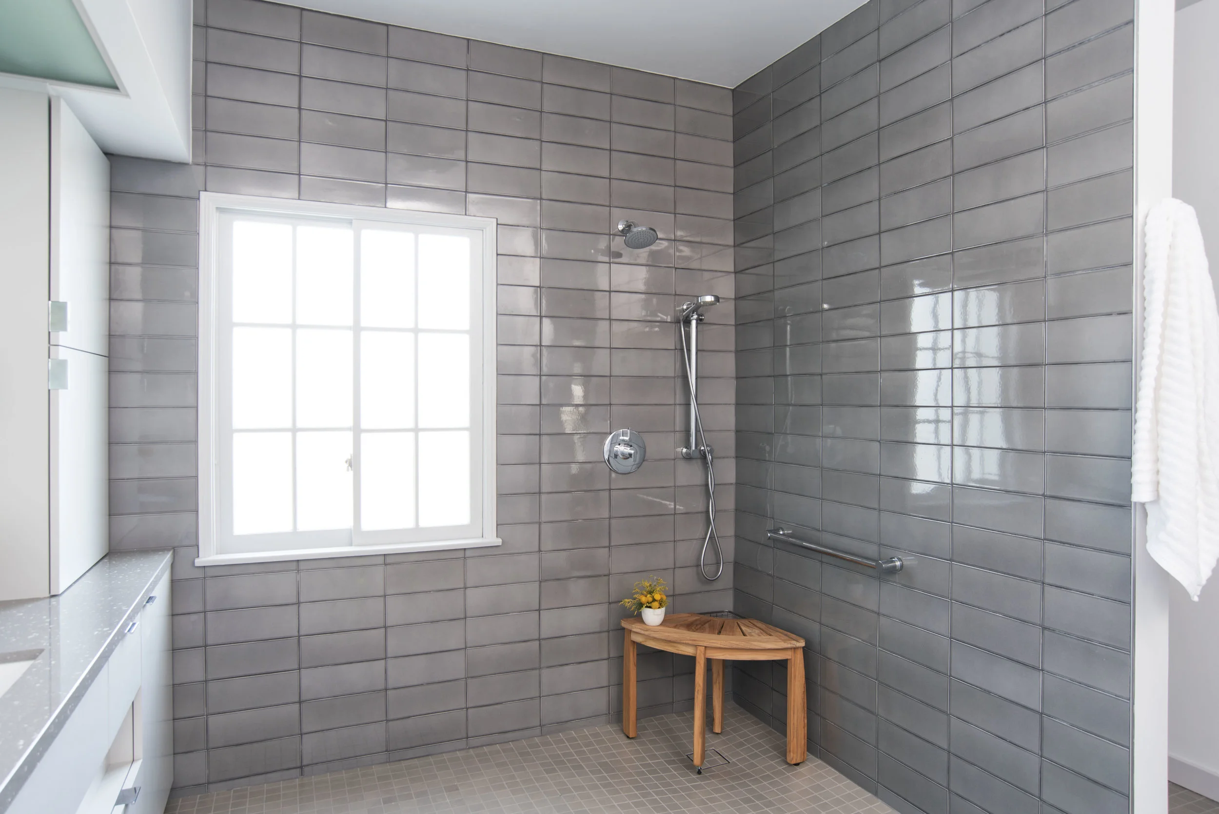
Upstairs, the owner requested an expansive shower, so the primary bathroom became a "wet room." Sarah planned for every eventuality in the owner's future, including her long term health and well-being using universal design principles. The result was a space free of any barriers like steps or glass shower walls.

sarah-barnard-design-luxury-minimalism-vanity.jpg

Sarah designed the space to feel light and boundless by selecting custom cabinetry, also adding storage and architectural interest to this modern primary bathroom. Plumbing fixtures by California Faucets were chosen for their pure beauty, while the countertop slabs contain small pieces of natural shell, echoing the nearby ocean. Sarah finds that an element of nature adds a touch of calmness. Above the counter, diffuse split disc wall sconces were chosen to add a soft light to the room.

sarah-barnard-design-luxury-minimalism-shower.jpg

Both beauty and safety are prominent in Sarah’s Scandifornian design. Beautiful and sleek hand-glazed wall tiles inspired by sterling silver accompany durable and slip-resistant porcelain mosaic tile flooring that create a functioning and timeless atmosphere. Finally, an antique Victorian chair and a giclée print by artist D.J. Hall personalizes the fresh and crisp primary bathroom.

sarah-barnard beachy bathroom-20.jpg

While continuing the elegant, sparse aesthetic from the first floor, the primary bedroom suite fills the entire second floor of this beautiful minimal townhouse, so special attention was paid to make it simple and calm. As the owner explained, “I travel frequently, and the serenity of the space makes coming home very comforting.”

sarah-barnard-design-luxury-minimalism-master-bedroom-01.jpg

The homeowner cares about her health and her environment; she practices self-care through activities like yoga and Pilates. It was essential to her that her home be filled with natural materials. Sarah was careful as always to find organic and lasting materials that would contribute to her health and wellness. The primary bedroom suite now highlights the beauty of natural objects and materials while planning for maximum comfort and use. The space features a vintage leather headboard by Duxiana, and the artwork is a framed print of a painting by Marc Chagall (c. 1957). Glass orbs were chosen to provide soft bedside light that keeps the nightstands free for books and other objects.

sarah-barnard-design-luxury-minimalism-master-bedroom01.jpg

A second fireplace in a corner was made over in sterling silver-toned ceramic tiles, adding visual warmth. The marigold club chair beside it was made more personal with the addition of a handmade honey bee pillow embroidered by the homeowner.

Plants and flowers dot the suite, as Sarah adds plants whenever possible to create a healthy and natural environment. The unique collection mixed with healthy materials in the design of this townhouse allowed a meaningful and sophisticated style to emerge. After the completion of this redesign, the owner explained that what she loves best about her new home is “[the] serenity of the color palette and surfaces, the bold, visually arresting scale of the principal lighting fixtures, and the way the new surroundings accommodate favorite furniture pieces and decorative items.”  The newly finished home is a testament to the idea that less is more, and that health and natural design are the solutions to luxury.

sarah-barnard--24.jpg

Sarah Barnard designs healthy, happy, personalized spaces that are deeply connected to nature and art.

To learn more about Sarah Barnard Design, please visit www.SarahBarnard.com.

Photos by Steven Dewall.

Elle Decor: Designers Reveal Their Favorite Kitchen Paint

Sarah shares one of her favorite paint colors for kitchens.

elle.decor.design.favorite.paint.color

FARROW & BALL CABBAGE WHITE 269

"It's a delightful, versatile neutral that pairs brilliantly with blues, greens, and grays. The hint of green elicits thoughts of the first days of spring and the taste of fresh garden vegetables."

Kloss, Kesley. Designers Reveal Their Favorite Kitchen Paint Colors. Elle Décor. April 2016

http://www.elledecor.com/design-decorate/color/tips/g3027/best-kitchen-paint-colors/

Sarah Barnard designs healthy, happy, personalized spaces that are deeply connected to nature and art.

To learn more about Sarah Barnard Design, please visit www.SarahBarnard.com.

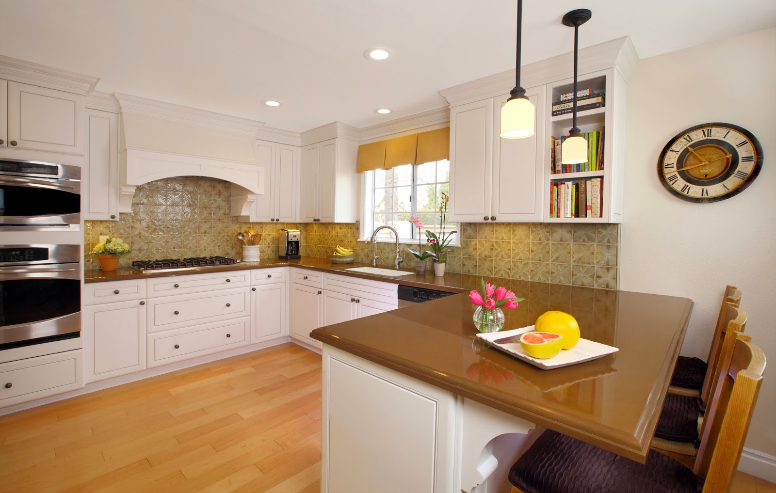
Design Profile: Kitchen + Great Room Remodel in California

traditional.country.kitchen.design
happy.open.concept.kitchen.design
pendant lights.country.kitchen
wine.storage.open.concept.country.kitchen.design
country.kitchen.design.
cozy.livingroom.green

Sarah Barnard designs healthy, happy, personalized spaces that are deeply connected to nature and art.

To learn more about Sarah Barnard Design, please visit www.SarahBarnard.com.